After looking at some pages, I decided that the pseudo horizontal rule works better for H2. It more clearly sends the message that this is a major section. Since Wikipedia does it, it should be familiar to people, and I don't think it would be considered an unprofessional look.
OK, this is better. Not necessarily better than last week's styles, but at least not far worse. The typeface no longer sticks out as typewriter-like, which I think is a huge improvement. (It is true it was only used in headers, but visually the headers dominate the impression the page makes, because they have such large font sizes.)
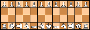
Presented in the comment the full-width underlining struck me as a bit weird, but I must admit that in the typical article with an Introduction / Setup / Pieces / Rules / Notes section it works.
Having headers in italics still strikes me as odd, though. But having 6 header levels seems overly generous; I was nottt even aware that HTML supported h5 and h6, and I cannot imagine I would ever need more than 3. So I suppose there isn't any real downside to having some of the lower-level headers in an uncommon style; most people won't need them, and the few that do need more than 3 levels but less than 6 can skip the styles they don't like.
The h5 style makes the impression of being 'incomplete', because it doesn't have left and right vertical borders. Even then, it is still a very exotic header style. The typeface of h1-h4 'blends in' very well with the typeface of the main text, but h5 and h6 somehow don't.
There still is a lare size gap between h4 and the main text. I would expect there to exist headers that had nearly the same size as the main text, but distinguish themselves by being boldface.
The font that is now on HTML buttons still seems fixed space. I don' think that is a good idea; it makes the buttons unnecessarily wide.
OK, this is better. Not necessarily better than last week's styles, but at least not far worse. The typeface no longer sticks out as typewriter-like, which I think is a huge improvement. (It is true it was only used in headers, but visually the headers dominate the impression the page makes, because they have such large font sizes.)
Presented in the comment the full-width underlining struck me as a bit weird, but I must admit that in the typical article with an Introduction / Setup / Pieces / Rules / Notes section it works.
Having headers in italics still strikes me as odd, though. But having 6 header levels seems overly generous; I was nottt even aware that HTML supported h5 and h6, and I cannot imagine I would ever need more than 3. So I suppose there isn't any real downside to having some of the lower-level headers in an uncommon style; most people won't need them, and the few that do need more than 3 levels but less than 6 can skip the styles they don't like.
The h5 style makes the impression of being 'incomplete', because it doesn't have left and right vertical borders. Even then, it is still a very exotic header style. The typeface of h1-h4 'blends in' very well with the typeface of the main text, but h5 and h6 somehow don't.
There still is a lare size gap between h4 and the main text. I would expect there to exist headers that had nearly the same size as the main text, but distinguish themselves by being boldface.
The font that is now on HTML buttons still seems fixed space. I don' think that is a good idea; it makes the buttons unnecessarily wide.