Check out Grant Acedrex, our featured variant for April, 2024.


[ Help | Earliest Comments | Latest Comments ]
[ List All Subjects of Discussion | Create New Subject of Discussion ]
[ List Latest Comments Only For Pages | Games | Rated Pages | Rated Games | Subjects of Discussion ]

Comments/Ratings for a Single Item

LatestLater Reverse Order EarlierEarliest
Storm the Ivory Tower. A Smess adaptation of Chinese Chess. (9x10, Cells: 90) [All Comments] [Add Comment or Rating]
Larry Smith wrote on Wed, Dec 28, 2005 03:28 PM UTC:Excellent ★★★★★
I had thought that I had previously rated this game. But after reviewing
all the comments here, I discovered otherwise.

I remember when a friend of mine dragged out a Smess game and tortured me
with it.  I was a fan from that day.

So when this XiangQi extrapolation of Smess appeared I was definitely
intrigued.  I suspected that the dynamics of each of these games would not
mesh well.  And the early version did have a few minor problems. This could
be the reason that I did not post an evaluation.

Now that the game has gotten a facelift, I took another look.

What can I say but 'Wow!'  Very nicely done.  The overall play of the
game appears to be quite nice. The various pieces interact very well with
the pattern of directions.  Now East Asians can enjoy the Smess
aggravation.

Here's a question: Is the name 'Smess' derived from 'It's a mess'?

Tony Quintanilla wrote on Mon, Dec 19, 2005 06:06 PM UTC:Excellent ★★★★★
Very nice graphics, indeed. Perhaps both the Smess and the recolored options could be provided.

🕸💡📝Fergus Duniho wrote on Mon, Dec 19, 2005 03:34 AM UTC:

Here is one possible recoloring of Larry's board. I added the moats back in to better distinguish the ivory squares from the neighboring light squares.


🕸💡📝Fergus Duniho wrote on Mon, Dec 19, 2005 03:12 AM UTC:

Here is how Larry's board looks with the Smess-style board's colors. Maybe some people would appreciate something like this with different colors.


🕸💡📝Fergus Duniho wrote on Mon, Dec 19, 2005 03:06 AM UTC:

Here is a board sent in by Larry Smith. Thanks, Larry. I renamed it and fixed the coloring of an arrow on one square. I am working on using this board as material for new alternate boards.


🕸💡📝Fergus Duniho wrote on Sat, Dec 17, 2005 08:16 PM UTC:
I did try extending the arrows on all squares, but some seemed to work better without extended arrows. In general, I avoided connecting orthogonal and diagonal arrows. I wanted lines to connect arrows mainly at 90 and 180 degree angles, so that a line would be a visual cue for a related pair of directions. In the center squares, extending all lines made the center point too fat. On h9, extending the diagonal line looked a bit too phallic. On other squares, extending lines made things a bit too crowded. The small arrows on b5 and h6 fit better with the small arrows on a5 and i6, and those on b6 and h5 looked better for matching b5 and h6. I haven't had any problem noticing the remaining small arrows. This may be because I am already familiar with the configuration of arrows used in the game. As you play it, you may become more familiar with the configuration of arrows too.

🕸💡📝Fergus Duniho wrote on Sat, Dec 17, 2005 07:59 PM UTC:
I'm certainly not saying that all ministers are dull, conservative, and unimaginative. At best, I will make the I statement that some ministers, maybe even many, are fuddy-duddies. I can't say I've ever actually met any. I haven't met any ministers of the political variety, since minister is not even a political title in the U.S., and the religious ministers I've met haven't seemed especially fuddy-duddyish. It's mainly a stereotype I pick up from the media, such as Rev. Lovejoy on the Simpsons.

🕸💡📝Fergus Duniho wrote on Sat, Dec 17, 2005 07:46 PM UTC:
One of my reasons for changing the name of the Dumbo is that I would like to lease or sell this game to a game company, and I don't want to worry about the Disney trademark on the name Dumbo. Also, its ears covered up some of the arrows on the squares the blue Dumbos started on.

(zzo38) A. Black wrote on Sat, Dec 17, 2005 07:10 PM UTC:
I like the Dumbo guy with a tie on his nose.

I also think that the arrows should be extended to the center of the squares

Jared McComb wrote on Sat, Dec 17, 2005 03:43 PM UTC:
But but but... the big-eared person with a tie over his nose was just so charming!

Thomas McElmurry wrote on Sat, Dec 17, 2005 07:19 AM UTC:
The only thing I would recommend changing on the latest board would be to extend all the arrows to the centers of the squares. On squares with both long and short arrows, the long ones are more prominent, and this may make it easier to miss the short ones.

I like the new Clodhopper and Fuddy-Duddy pieces in the Smess-style set. I preferred the name Dumbo, though, as it seemed so perfect for a piece based on the elephant. Fuddy-Duddy makes some sense too, but I've known ministers who are anything but dull, conservative, and unimaginative.


🕸💡📝Fergus Duniho wrote on Sat, Dec 17, 2005 04:03 AM UTC:
I've now uploaded an updated zip file with alternate piece sets and boards for the ZRF. These include the last board I showed here plus two more, one being similar to another board I showed earlier. The new piece sets include Big5 Chinese, GB Chinese, Western Chinese, Eurasian, and Alfaerie. I have recolored the Smess-style board for better contrast and visibility. The blue arrows are now violet, which is actually closer in color to the arrows on my Smess board, and the yellow squares and green arrows are a bit darker to reduce glare. I have renamed the Dumbo piece the Fuddy-Duddy, I have redesigned the Clodhopper, and I have redrawn the whole Smess-style piece set for consistency of style. In case I want to change anything later, I'll wait for feedback before sending this updated zip file to Zillions of Games. I'll work on new Game Courier presets tomorrow.

Anonymous wrote on Fri, Dec 16, 2005 07:17 PM UTC:
Classy. Good pictures. Nice resolution. Thanks.

Jared McComb wrote on Fri, Dec 16, 2005 07:06 PM UTC:
I think it would look best with the colors of the wooden one, but without
the texture.

Just my two cents.

🕸💡📝Fergus Duniho wrote on Fri, Dec 16, 2005 05:03 PM UTC:
I'm glad you like it. I like it too. Thanks for your help in making this possible.

🕸💡📝Fergus Duniho wrote on Fri, Dec 16, 2005 04:42 PM UTC:

Here is my latest version of the board. I have added more connecting lines between arrows. These eliminate the problem of optical illusions without resorting to texturizing the board. They give each space a specific shape that helps define the terrain of the board. This allows for a board with simple colors and good contrast. I have also eliminated the lines between spaces, which are important only for a monochrome board, such as the ones Michael originally made. I will be using this board as a template for textured boards, since such boards still look nice and work better with certain piece sets.


Gary Gifford wrote on Fri, Dec 16, 2005 10:45 AM UTC:Excellent ★★★★★
Excellent again! Michael's tan board is very good. Much like my physical board for 'All the King's Men.' Very easy on the eyes. Fergus's Chinese pieces look good on this board. I am curious as to what Michael's pieces look like and will ask for a copy via e-mail, unless there are plans to display that scenario here. I greatly appreciate the time and effort Michael and Fergus have put into this project. In regard to the 'New Coke' hype idea... I can say, 'Nonsense.' We are talking about game design here. Two very different boards and very different piece sets as an attempt to please players with different tastes. The fact that this gives a great new game publicity is an added benefit. Anyone not liking the STIT comments, of course, can skip them. But I think they have lead (or are leading to) to a very worthwhile conclusion. I look forward to seeing the game logs for STIT. Best regards to all. And thanks again... very much.

🕸💡📝Fergus Duniho wrote on Fri, Dec 16, 2005 04:49 AM UTC:

Michael Howe wrote:

My personal preference at the moment, though, is still my tan-squared board with little black arrows, although now I'm considering giving it the same color-treatment. I doubt that I can do the texturing, though, with the simple software I use to make graphics.

You don't need to. Once I did the triangle board, it was simple enough to apply the same process to the new board. Here is the result. BTW, the graphics program I use is Ultimate Paint, a fairly inexpensive shareware program.


🕸💡📝Fergus Duniho wrote on Fri, Dec 16, 2005 04:35 AM UTC:

Here is a recolored redesign of Michael's latest board. His board used small arrows in place of the triangles. I drew lines between some arrows, then recolored it. It uses wood (maple and walnut) for most of the board and marble for the river and Ivory Tower. I think it looks best with the Big5 Chinese set shown in this screenshot.
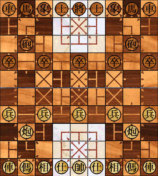

Thomas McElmurry wrote on Fri, Dec 16, 2005 02:39 AM UTC:
I rather like the whimsical, hyperactive feel of the Smess board and of the Smess-style board Fergus has created for Storm the Ivory Tower. I haven't played the game yet, but I expect that this board would add to the experience in one way, by giving it a unique flavor, but detract from it in another way, as the loud colors and diverse styles of arrows might make it hard to see several moves down the game tree. (But perhaps playing a few games would help me to understand the structure of the board better, so that I wouldn't have to rely as much on the visual representation.)

I also like the more minimalistic look of Michael's board. I don't think I would have any trouble playing on this board. I can see where Fergus is coming from, though; I wouldn't call them optical illusions, but in some parts of the board the patterns formed by the triangles are noticeable. Some of these patterns have their own kind of beauty, and to my eyes they don't obscure the squares, but I can easily understand how some people could find it hard to play on this board, just as others find it hard to play on the Smess-style board. My own opinion is that Fergus's board is more fun to look at, but Michael's would probably be easier to play on.

As I write this I've just noticed Fergus's recoloring of Michael's board, which I like very much. The checkering helps a great deal (more than I expected), the texture gives the board life, and the colors are very well chosen. And it preserves the elegant simplicity of Michael's design.

If there's any interest in yet another StIT board, I think it would be nice to have one in the style of All the King's Men, which I think in at least two ways would be an appropriate complement to the Smess-style board. In All the King's Men, the squares resembled a wooden floor, and the arrows had a simple, uniform style, easy to see but not distracting. Iff Fergus and others are interested in having such a board, and if no one else wants to create it, I would be willing to try my hand, although I probably won't have the time until after New Year's Day.

BoardGameGeek's Smess page has some nice images of various editions of Smess, Take the Brain, and All the King's Men.


Larry Smith wrote on Fri, Dec 16, 2005 02:30 AM UTC:
My vote is for the original Smess-style playing field.  Please keep it.

You might offer that alternate field in the ZRF, if you wish.

My conspiracy antenna is giving me the signal that all this might be a
New_Coke/Classic_Coke propaganda ploy.  Push out a revised product to
create controversy and get lots of public attention then revert to the
original under the illusion of responding to public demand. 

Nah! No-one would ever do that! Would they? ;-)

Gary Gifford wrote on Fri, Dec 16, 2005 02:19 AM UTC:Excellent ★★★★★
Outstanding! Great job Fergus! Now this board, a coloration of Michael's submission is a true work of art, fit for framing. Thank you very much Fergus for creating this version. And thank you Michael for designing the original. When it has complimentary pieces to go with it I'm fired up to play!

🕸💡📝Fergus Duniho wrote on Fri, Dec 16, 2005 01:33 AM UTC:

Here is a recoloring of Michael's original board that I like much better. One trick I found helpful for reducing the tendency toward inducing optical illusions was to checker the board AND make the triangles the same color as the other color of square. I used black triangles in the Ivory Tower for better contrast. Another helpful trick was to combine the board with a marble background to give it texture. This helps the eyes to better distinguish each square. I converted it a JPG to display on the web.


Mark Thompson wrote on Fri, Dec 16, 2005 01:00 AM UTC:
I also prefer the 'optical illusion' board. I prefer plain things over garish. And the idea of checkering it sounds very reasonable to me too.

Gary Gifford wrote on Fri, Dec 16, 2005 12:28 AM UTC:
Thanks for displaying Michael's board, it is much easier for my brain to quickly see what's going on directionally. But I am wondering if a checkered version would be a further improvement? [The colors used on the Switching Chess pre-set, I think, would be very good] I think it would reduce the optical illusion factor (which if I stare at the board a while I do see). Anyway, given the choice of the two boards I greatly prefer this one. But what pieces would go on it? Chinese ? Thanks again to both Michael and Fergus for putting the effort into getting an optional, more traditional board and set. P.S. One reason I don't like the current set and board can be realized if you picture a book of chess problems. Now, imagine a similar book with STIT problems using the current board and pieces. I solve chess problems in my head every night, many quite fast... but the nature of the STIT board and pieces would require that I analyze the STIT diagram a long time just to understand what is where. Plus those little eyes and comic images, well I have trouble taking them seriously.

25 comments displayed

LatestLater Reverse Order EarlierEarliest

Permalink to the exact comments currently displayed.