Ratings & Comments
I wish this game were more popular. It seems like an excellent design. The piece selection seems strange at first but after thinking about it I can see the beauty of it.
I imagine the aanca could have originated as an enhanced ferz, to go with the bigger board. Then the knights could have become unicorns by gaining a diagonal slide after their leap to complement the aanca. The crocodile is a fairly obvious addition. The giraffe and Lion both make knight-like leaps, suitable for the large board, and the Lion includes and extra 3,0 leap which removes it's color binding and forms a nice looking pattern.
The result of all that is eight pieces with a nice range of power and an aesthetically consistent set of moves. There are all of the 2,1 3,1 and 3,2 leaping moves, the rook and bishop moves, and bent rook and bishop moves (unicorn and aanca). The leaping pieces are differentiated in power by some of them having additional movements, but they don't ever feel like arbitrary combinations.
The initial setup is also elegant. The Pawns start as far apart as they do on the 8x8 board, and the pieces are all on the back rank. The promotion rule fits well with this setup and is another great innovation.
I think the main weak points, if there are any, would be the pawns and the king's leap. It seems unlikely that the king would benefit much from a 2 square leap on such a big board with so much empty space; and perhaps modern pawns would be better. But overall this variant appears to be carefully designed.
I changed some H2 tags to H3 tags, and I moved one section from Rules to Notes. The script for displaying member-submitted content normally adds the appropriate H1 and H2 tags, and tags entered by the author should begin with H3.
Thanks for your feedback.
I have reinvented this chess variant into Kingsmen. The pawns are on the third rank like in Shogi, and cannot double advance on the first move (and hence no en passant).
Also like Shogi, all non-royal pieces in Kingsmen promote on the last three ranks. A promoted piece can move like a King (one square in any direction) in addition to its original moves.
I was thinking at bent riders that take 2 steps and then bend and keep going to that direction. This would be called very plastically Rook2 then bishop and Bishop2 then Rook. Would 2.Manticore and 2.Griffon be good names for them?
HG,
You have explained to me here :
https://www.chessvariants.com/index/listcomments.php?id=33121
how to set up a machine match to test something. Is this still the way to do it or are there different things now?
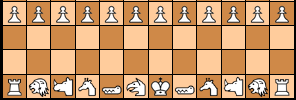
I tidied up this page, replacing non-Unicode characters, and replacing the low effort ASCII diagram with one generated by Game Courier. It's still an ASCII diagram, because I wasn't sure what images to use for some of the pieces.
I have adjusted the em values for the headings so that specific integer pixel values will be used when the body font is 16px. These are 36px for H1, 32 for H2, 29 for H3, 26 for H4, 21 for H5, and 18 for H6. Instead of making the differences the same between each pair of neighboring headings, I used smaller differences where the style changed more, and I put a distance of .5em (8px) between distant headings using the same style.
Instead of setting the body text at 18px, I have erased code for setting the size of the body text, so that it will now use the system default. On the Windows desktop, at least, this is typically 16px. I checked multiple devices, and on each one, it seemed to make the text smaller, though Android and iOS devices did not let me inspect the elements and determine the precise size.
One reason for making this change is that Literata, which is now the body font instead of Lora, has a clearer look at smaller sizes. Another is that it should make the display more responsive to particular devices. Instead of using a fixed size across all devices, it lets the device determine the size. Also, I had previously set the font-size for comments to 16px, and I haven't had trouble reading comments. However, comments will now display text at the same size as the main content instead of at a smaller size. So, comments should generally display at the same size as they used to. Finally, the font size will now better match whatever zoom level someone prefers to use his browser at.
Since the heading sizes are defined with the em unit, which is determined by the body font size, they adjust according to the body font size. So, with the body font a bit smaller on most devices, the headings will also be a bit smaller.
 H. G. Muller wrote on Thu, Jun 10, 2021 06:24 PM UTC in reply to Fergus Duniho from 05:42 PM:
But can you also do that with headers?
Someone might want to add paragraphs in a smaller-than-standard font.
If you want small text, you can enclose your text in <small>small tags</small>.
💡📝H. G. Muller wrote on Thu, Jun 10, 2021 05:20 PM UTC:I had computer trouble, so I had no opportunity to check it out yet.
Fairy-Max does ignore game names that start with a capital. I forgot what was the reason for that (but originally there was one). But when you change the T to t the variant will appear in WinBoard's New Variant menu, from where you can select it. (If you did not put the definition too far down in the fmax.ini file; WinBoard can only display a limited number of engine-defined variants.
You did not specify what piece should be used for K/k in the pieceToChar string. Change it to
PNBRQ.EA.........G......MKpnbrq.ea.........g......mk
@HG,
Haven't you seen my comments or was I unclear?
H. G. Muller wrote on Thu, Jun 10, 2021 03:54 PM UTC in reply to Fergus Duniho from 02:06 PM:I looked into the default sizes of H1-H6, and I learned that by default, H4 is the same size as the body text, and H5 and H6 are even smaller. This doesn't make sense to me. Headings should always be larger than the body text.
Someone might want to add paragraphs in a smaller-than-standard font. And these might need headers too.
Four header levels already seems quite generous to me.
I think the H2 text size is very, very large. I'd like to see that scaled down a bit, but things are looking better.
Is that because you are used to it being smaller, or because there are specific pages on which the H2 heading is too long?
I looked into the default sizes of H1-H6, and I learned that by default, H4 is the same size as the body text, and H5 and H6 are even smaller. This doesn't make sense to me. Headings should always be larger than the body text. Additionally, higher level headings should be larger than lower level headings, and size differences between headings of the same style should be large enough to tell them apart. Bearing these considerations in mind results in the headings all being larger than they are by default. This doesn't leave a lot of room for adjusting the size of H2, which is already closer to the size of H3 than to the size of H1.
Additionally, text is appearing larger on Chrome than on Firefox. I normally develop on Firefox, but if you're using Chrome, you will see larger fonts than I normally do. When I inspect the page h1-h6-test.html, which has no CSS or styling, it gives me the same values for the font sizes even though it appears larger on Chrome. In inspecting, Xiangqi, I get the same values for the style elements, though I cannot get Firefox to give me the size in pixels. I need to look into why text is larger on Chrome and see if there is some way to standardize the size in different browsers on the same computer. You may inspect these pages yourself with Developer Tools on Chrome or Web Developer Tools on Firefox.
There are pages on which I plan to use a different style or a lower heading level. These would include link pages, Zillions pages, and Game Courier preset pages, which normally have fewer sections and less text than other pages. I'll work on that later.
You can press ctrl+f5 to clear cache for current page only
Greg Strong wrote on Thu, Jun 10, 2021 12:57 AM UTC in reply to Fergus Duniho from Wed Jun 9 02:10 AM:You might want to read the later comments before replying to earlier comments that are no longer pertinent. If you still see the double underlines, you need to clear your cache.
You are correct - my appologies. I'm travelling and on my father's computer, so I didn't want to clear cache, but I've opened a different browser so I can see how it looks now. This is a definite improvement. I think the H2 text size is very, very large. I'd like to see that scaled down a bit, but things are looking better.
The h5 style makes the impression of being 'incomplete', because it doesn't have left and right vertical borders.
It also doesn't have horizontal borders. If you are seeing it with any borders, you need to clear your cache.
The typeface of h1-h4 'blends in' very well with the typeface of the main text, but h5 and h6 somehow don't.
Also, those no longer use small-caps. Clear your cache to see how it currently looks.
HG, I had tried again but have not managed to do it. I don't yet need to set up a machine match, this will come later. I only need to know if fmax can play the game.
H. G. Muller wrote on Wed, Jun 9, 2021 06:56 AM UTC in reply to Fergus Duniho from Tue Jun 8 09:33 PM:After looking at some pages, I decided that the pseudo horizontal rule works better for H2. It more clearly sends the message that this is a major section. Since Wikipedia does it, it should be familiar to people, and I don't think it would be considered an unprofessional look.
OK, this is better. Not necessarily better than last week's styles, but at least not far worse. The typeface no longer sticks out as typewriter-like, which I think is a huge improvement. (It is true it was only used in headers, but visually the headers dominate the impression the page makes, because they have such large font sizes.)
Presented in the comment the full-width underlining struck me as a bit weird, but I must admit that in the typical article with an Introduction / Setup / Pieces / Rules / Notes section it works.
Having headers in italics still strikes me as odd, though. But having 6 header levels seems overly generous; I was nottt even aware that HTML supported h5 and h6, and I cannot imagine I would ever need more than 3. So I suppose there isn't any real downside to having some of the lower-level headers in an uncommon style; most people won't need them, and the few that do need more than 3 levels but less than 6 can skip the styles they don't like.
The h5 style makes the impression of being 'incomplete', because it doesn't have left and right vertical borders. Even then, it is still a very exotic header style. The typeface of h1-h4 'blends in' very well with the typeface of the main text, but h5 and h6 somehow don't.
There still is a lare size gap between h4 and the main text. I would expect there to exist headers that had nearly the same size as the main text, but distinguish themselves by being boldface.
The font that is now on HTML buttons still seems fixed space. I don' think that is a good idea; it makes the buttons unnecessarily wide.
In the case a pawn is on the 7th rank without a piece captured (unlikely), let's say you can move it to the 8th rank and remains a pawn unless its twin promotes later.
You might want to read the later comments before replying to earlier comments that are no longer pertinent. If you still see the double underlines, you need to clear your cache.
Greg Strong wrote on Wed, Jun 9, 2021 01:58 AM UTC in reply to Fergus Duniho from Tue Jun 8 10:42 PM:It's important to distinguish each heading level by a different visual style.
This is a hobbyist site, weird is a personal opinion, and there are only so many different ways of distinguishing six levels of headings by style.
Wavy underlines, which I already tried out, look much worse.
Fergus, I'm pretty surprised at what I'm reading. You have suddenly decided, unilaterally, that six levels MUST be displayed so differently that it slaps you in the face. And, if the double underline looks terrible, hey, at least they are not wavy? Is that really your answer?
I think you would agree that I have complained about very, very little all these years, despite several large issues worthy of complaint. I'd rather not go into enumeration, but I will if you doubt it.
The fact is 99% of the content on this site was not created by you. You cannot just do whatever you want with it. The huge, bold, double-underline type is categorically unacceptable to me.
25 comments displayed
Permalink to the exact comments currently displayed.
I made some modificaions to the AI of the Interactive diagram. In particular, I simplified the Quiescence Search. This because it was prone to search explosion in variants with super-powerful pieces (such as hook movers and multi-capturers). The new QS only always searches capture of the last-moved piece when it is worth less than the attacker, or when it is unprotected. Other captures are only searched if there is enough remaining depth; new captures (i.e. those not possible 2 ply earlier) require a depth of 1/2 ply, other captures a full ply. This puts a limit to how long an exchange can continue.
This new QS is weaker then it was (but faster, and in complex situations far faster). To partly compensate that the default search depth is now 2.5 ply instead of 2 ply, and the depth can be adjusted in steps of 0.5 ply (from 2 to 4 ply).
I also slightly improved the positional bonuses for centralization; the bonus for that is now flatter in the horizontal directions, and pieces with a forward orthogonal slide but no distant other forward moves (such as Rooks and Lances) are exempt from the bonus. This avoids the annoying Rb1 after Nc3, then followed by Rc1 after Bd2, and prevents amassing all pieces on the central two files.