Comments/Ratings for a Single Item
Thank you Bob, that's nice from you. However, that makes them available mainly for me, who have them already of course, as they are mine.
I would like an editor to put these graphics in the folder which bears my name!
I have been asking this regularly from times to times, I hope one day someone will care.
Thanks again anyway.
These comments should be visible to all, including Fergus and the other editors.
I unzipped the file JLCChess.zip to /graphics.dir/cazaux/, and you will find your images in
https://www.chessvariants.com/graphics.dir/cazaux/JLCChess/
However, there are two issues. First, your file names do not match the names of the files we already have of your images. Game Courier mainly uses pieces in the cazaux/shako directory, which have mixed case names, and all your new files have lowercase names. So, your new images cannot be used as a drop-in replacement for the ones we already have. Second, these are all .bmp images, which is fine for Zillions-of-Games, but on the web, we normally use .gif. .png, or .svg images.
Thank you Fergus for this, I'm glad of this replacement.
I didn't expect those problems, I'm sorry. Is there a way to find all pages or GC that use the "old Cazaux"?
For example, the Shako GC is available with 2 other graphics options, so it won't be a problem if the 3rd one with "old Cazaux" is simply removed.
Concerning the format, indeed I can do a batch conversion from .bmp to .gif or .png and send or upload another zip. If I do that, shall I remove the green background? Just let me know.
Last question, I could prepare another page to present/show all graphics like this old one:
https://www.chessvariants.com/graphics.dir/cazaux/catalog.html
which is accessible from:
https://www.chessvariants.com/graphics.dir/index.html
Would it be useful?
If I do that, shall I remove the green background?
No, leave it green, but also make it the transparent color.
Yes, a page presenting your graphics would be useful.
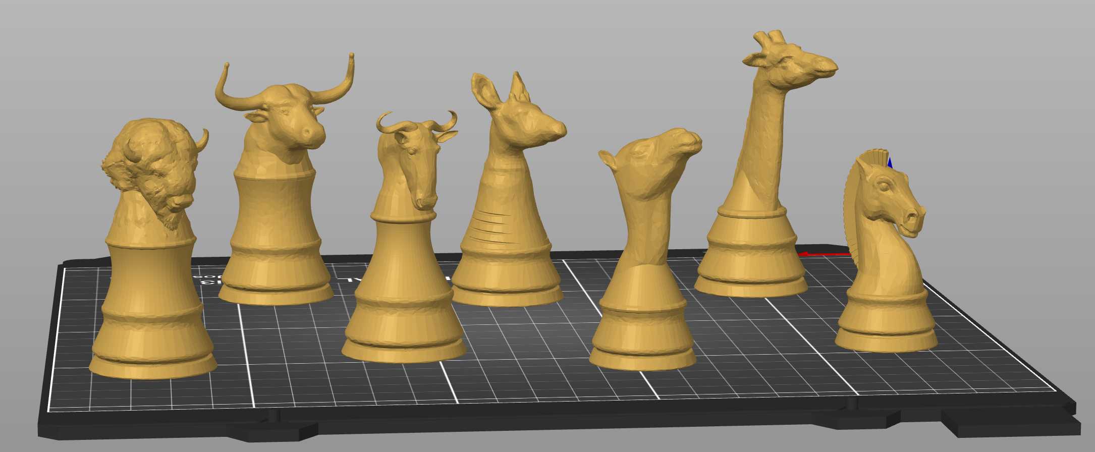
My design of ungulate pieces. Compared with size.

 H. G. Muller wrote on Thu, Dec 28, 2023 11:12 AM UTC in reply to Jean-Louis Cazaux from 08:35 AM:
The cockscomb makes the Phoenix look a lot like a chicken. A Phoenix is not supposed to have that, is it? All images I googled for do show a lot of fluffy feathers at the back of the neck, and you did that very well. As for the beak: most images I found have the beak of a bird of prey.
The Kirin looks a bit too messy for my taste. I suppose the wild protrusions represent flames. But it is very hard to create the impression of flames in a static object. If I were to make a Kirin I would use a dragon's head (up-curving snout) with antlers.
Were you able to transfer these from STL to Jocly??? They look great!
@HG: On the Phoenix you missed an important point. You know that this piece is taken from chu shogi. There what has been translated "Phoenix" is more the Fenghuang (Hoo). And this one is like that, more rooster than eagle. Anyway, I'm thinking to modify it a little bit.
For both this piece and the Kirin (Qilin), I have taken models from Chinese-style works.
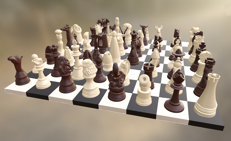
All my 3D designs in one screenshot, with Blenders.
Some pieces are unpublished yet, the cerberus for example. Is it for personnal use?
The Cerberus with 3 dog's heads was a temptative to represent the Reaper, i.e. the "triple barrel" Rook+Gryphon.
I was thinking of it for giant CVs. As well as some other compound monsters, an Hydra (3 snake's heads for the Harvester Bishop+Rhinoceros), a Simurgh (Bishop+Gryphon), an Indrik (Rook+Rhinoceros), a Godzilla (or T-Rex, Gryphon+Rhinoceros).
For the moment, I put them aside. They are really very powerful, a bit too much.
May someone tell me where a QAD is used (apart from my own Patchanka and recent Kevin's Compound chess)?
I know that someone commented about it recently (was it HG?), but I can't find that information again. I need it. Many thanks
Doing a bit of a search, I did find it as the Queen in Big Battle (thanks to Who is Who on Eight by Eight, which calls it OverQueen). I don't know if it's what you're thinking of, though.
Bn Em wrote on Tue, Feb 20 12:36 AM UTC in reply to Jean-Louis Cazaux from Sun Feb 18 07:27 PM:H.G. had mentioned Superchess
Grand duke in superchess
@Fergus: i don t know why there is a different font for the refs to my books, or to some pages. It is probable not intentional as it is not nice looking.
Those are external links, which are now indicated with a monospace font and double underlines. They might look better as a list with one on each line.
@Fergus: the pt size of the fonts are different, the one for external links is smaller, so they don't match. It doesn't look very nice, looks cheap. Have you looked to use a sans-serif font in order to contrast with the serif font of normal text?
the pt size of the fonts are different, the one for external links is smaller, so they don't match.
That was true when David previously used the monospace font for external links. But it's no longer true, and when I inspected the page with Edge, the body text, the local links, and the external links were all 16px.
It doesn't look very nice, looks cheap.
It doesn't look very nice when you have so many external links crowded together. That's why I suggested putting them in a list.
Have you looked to use a sans-serif font in order to contrast with the serif font of normal text?
I just tried it with Web Developer in Firefox. While both sans-serif and mono worked better than serif, I didn't see a lot of improvement in using sans-serif instead of mono. When I look at the column of external links in the footer, which have been formatted into a list, they looked better in mono.
There were a few other reasons why your external links looked bad, which I have corrected. You missed a comma after one link, you omitted the word and before the last link in your sentence, you left out the period at the end, and you placed your spaces inside the links instead of outside. With these problems corrected, it is now easier to tell each link from the other. Even so, I still think using a list would be an improvement, especially if you also put the parenthetical information after each link instead of inside of it.
OK, it's a bit better, although still a bit strange. But it's enough for tonight.
25 comments displayed
Permalink to the exact comments currently displayed.
I've got your icon collection right here -- at least, until they're posted in place of your old ones. :)