[ List Earliest Comments Only For Pages | Games | Rated Pages | Rated Games | Subjects of Discussion ]
Comments/Ratings for a Single Item
This screws up tables. I think you should revert to the old typography.
Give me links to pages whose tables are being screwed up.
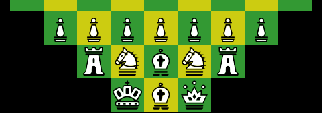
This page has the piece diagram as a table, and the squares aren't uniform. Sometimes they even get bigger or smaller when you move a piece. Also, I liked the old font.
4 comments displayed
Permalink to the exact comments currently displayed.

I'm working on improving the typography, and I could keep on trying things, but it's time to turn off the computer. For now, the body text is 20px EB Garamond, and the headings are in Germania One. These might change tomorrow. I might use Germania One only for top headings and use a grotesque font for lower headings. I will be trying out more font combinations tomorrow. Note, these changes are only in global.css so far, not in globalindex.css. So they only affect regular pages, not index pages like the one you're reading this on.