Comments/Ratings for a Single Item
This screws up tables. I think you should revert to the old typography.
This page has the piece diagram as a table, and the squares aren't uniform. Sometimes they even get bigger or smaller when you move a piece. Also, I liked the old font.
The shape of the squares is easily fixed by setting the height and width of each table cell to the same value, as I do for diagrams rendered as tables in Game Courier.
There was no body font before. It just used whatever font was default in your browser. This could be Times New Roman in Windows, Droid Serif on an Android, or Helvetica on a Kindle Touch, which is what I am using now.
While the spaces in the diagram seemed fine on my desktop, they are elongated on my Kindle and on my phone. Since I ran Chrome on both my desktop and phone, it seemed that the screen width was the important factor, not the browser. To confirm this, I changed the window size on my desktop, and when I made it narrow enough, the spaces in the diagram became elongated. More precisely, they were narrow but tall. It seems that the piece size shrank to fit the narrower screen, allowing the spaces to get narrower, but nothing happened to make the spaces shorter.
I temporarily undid the changes in the typography and checked the diagram for Chess and a Half again. When I made the window narrow enough, it still had elongated spaces. So, this problem appears to be unrelated to any changes I've made to the typography.
I just checked how a diagram table works in Game Courier, and it behaves differently when I narrow the screen. It does not change size at all, and it limits how much I can narrow the window. To make the window even narrower, I switched tabs. When I switched back, the Game Courier table for Chess was no smaller, but less of it appeared in the window. The way Game Courier fits diagrams on small screens is by resizing them to fit the screen, using information on the screen size that it has previously stored in cookies.
But right now, the spaces are elongated even if the window is full width or even full-screen!
I took a copy of the generated source for Chess and a Half, changed the height and width of each cell from 51px to 3vw, and each cell remained a square even when I made the window very narrow. Here is the test page I created. The vw unit is 1% of the view width. So, a vw of 3 is 3% of the view width. While a value of 3vw closely matches 51px on a wide screen desk monitor, it doesn't make the best use of the available space when the window gets narrower. I also tried a value of 5vw, and this looks a lot better in a narrow window.
That is due to it being a copy, not to any changes I made to the width and height.
EB Garamond looks better than Crimson Text. The latter has some miniscule artefacts around the letters that shouldn't be there.
Volkhov is too dark for the desktop, but being darker than Garamond aids legibility on my Kindle and on my phone. So, I have presently setup the CSS to use EB Garamond as the default body typeface and to use Volkhov when the screen becomes narrow enough to drop ads from both sides.
 H. G. Muller wrote on Sun, Oct 1, 2017 05:21 PM UTC:
I have been working on improving the typography of the site today. If you need a specific font size, I suggest you use absolute values instead of relative values. Inspecting the generated source on one of your diagrams, it looks like you might have already done this. I saw a font size of 7px for each TD instead of xx-small.
I have indeed tried a lot of things, but no luck so far. The best explanation of the problem (extra margin below images) that I could find is here. It gives a number of possible solutions / work-arounds, (some of which also mentioned on stackoverflow.com) and I tried them all, but none of them has the slightest effect.
I had this problem of extra margin below images before, and the xx-smal font did ameliorate it (but still required the square size to be defined 3 pixels larger than the actual images, 53x53 for Alfaerie). But this work-around stopped working, and setting an absolute size of 7px doesn't make any difference. It seems completely ignored, as for a 7-px font the descenders should only be ~3px, the margin I already account for. But they are obviously much larger.
I would prefer to make the problem go away completely. But defining the images with an in-line style="display:block;" has no effect, and eather has the "float:left" or "vertical-align:top". (I tried on FireFox and Chrome.) I can live with the work-around of a small font. But I have no idea why that stopped working. What was changed? Did you define another DOCTYPE, or another size default font? All articles are suddely in a ridiculously large font.
I can try a negative margin under the images; testing locally it responded to that, and I could even have the images stick out under the cells. It would be tricky to find a margin size that works for all image sizes, and would be robust against future typography chages if I don't know what I am combatting here. Setting a fixed size of the page width doesn't seem a satisfactory solution. Anyway, setting a size for the cells never succeeded in making this problem goeas away: if the image (+added margin) is larger than the width I specify, it just expands the cell to fit the image, rather than clipping the image. Do you know a way to get around that?
[Edit]
Uh? I now changed the font in the <td> elements to xx-large, and this made the problem go away entirely. The images themselves have style="veritical-align:top", but in combination with font-size:xx-small that did not have the slightest effect.
Did you see my comment about using the vw unit instead of the px unit? That seems to be the solution.
H. G. Muller wrote on Sun, Oct 1, 2017 05:43 PM UTC:Did you see my comment about using the vw unit instead of the px unit? That seems to be the solution.
As I understand the meaning of vw, this would make the size of the cells dependent on the size of the window of the client, while the piece images have a fixed size. That seems an infinitely worse problem than the one we are trying to solve. Of course you can get it right for one particular window size of one particular user, but everyone else would see crap, and even if the user to which it was tuned would size his window, his image would also be destroyed.
But I just had some success by setting font-size:xx-large . Which completely baffles me, as it is exactly the opposite of what I expect.
Tentative theory is that having a font size that is too small somehow prevents the normal work-arounds for making the bottom margin of images go away from working. (Which should be considered a browser bug, but it is strange that both FireFox and Chrome exhibit it.) Your typography change must have done something that brought us into the realm where things do not work as advertized. When you undid that change, I had already defined the font-size as an absolute 7px, which is very small, and thus also in the broken realm, and no longer affected by typography. With font-size:xx-large we now apparently have a font size where the vertical-align:top trick does work.
As I understand the meaning of vw, this would make the size of the cells dependent on the size of the window of the client, while the piece images have a fixed size.
No, piece images shrink when the width narrows. In the CSS, all images have max-width set to 100% and height set to auto.
I now have a combination of fonts I am happy with for the main body and headings. The body text will be either EB Garamond for wide screens or Volkhov for narrow screens. Both are good looking serif fonts that bear some resemblance to each other. For example, both let the capital M stretch its legs, and various other letters bear a close enough resemblance to each other. The main difference between them is in their color, which is a typography term referring to how dark or light a font is. To illustrate what this means, bold text is normally darker than regular text. Garamond is a thin, old style font. It has class and looks good when it has enough space. Volkhov appears too dark on a full-size monitor, but being darker makes it very legible on a small mobile screen. So it gets used there in place of Garamond.
The first and second level headings use Germania One. This is a dark Roman typeface that has a medieval look to it without actually being Blackletter or Fraktur. The medieval look seems suitable for Chess, and being a Roman typeface, it is more legible than Blackletter or Fraktur would be. This font is more eye-catching than a sans-serif, yet it has enough elements of a sans-serif to contrast well with the serif body text.
The third through sixth headings use Francois One. This is a dark gothic/grotesque sans-serif that matches Germania One in color. This match in color allows it to fit well with Germania One. But being a sans-serif helps it distinguish the lower headings from the top headings, and since the lower headings use smaller type, being sans-serif helps make it more legible at the smaller sizes it is used in.
H. G. Muller wrote on Sun, Oct 1, 2017 08:15 PM UTC:Well, I don't know about others, but if I would rate last-week's style as 8-out-of-10, the way it looks now doesn't even qualify as 5-out-of-10.
- Text font: too large, low information density, needs lots of scrolling
- Text font: too light, looks vague
- Headers: awful typeface. Only one notch above using Hebrew.
Greg Strong wrote on Sun, Oct 1, 2017 09:25 PM UTC:I don't understand. The text size hasn't changed at all for me. The font might be different, I'm not sure, I'm seeing no obvious changes. And the text doesn't look any lighter either...
I am using Google fonts, because this allows me to use the same fonts on all devices, no matter what fonts they may have installed. I am currently trying out Radley as a body text instead of EB Garamond. It is darker than Garamond, which makes it more legible, but it is still not as dark as Volkhov, which is a bit too much on a desktop. It appears to be a transitional font, which means it combines elements of old style with the thick/thin line contrasts of modern. Its character designs resemble Volkhov, and it differs from it mainly by being lighter.
I'm currently trying out Libre Baskerville with a font-size of 1vw. A font-size of 1.25 vw made Garamond about the same size as I had it with 20px, but using the vw unit would keep it at about the same size if I changed the screen resolution. Since Libre Baskerville has bigger characters, I dropped it to 1vw. Using vw units should keep the text from appearing larger on laptops than it does on larger monitors.
Using the vw unit made the text miniscule on my phone. So that's not a viable option.
Presently, it uses 20px EB Garamond for the widest screens, 18px Radly for narrower screens like you would find on a laptop, and 16px Volkhov on mobile devices.
I'm checking things out on the laptop right now, and EB Garamond looks better than Radley on the laptop.
I have replaced Radley with Lusitana. Like Radley, its color is lighter than Volkhov and darker than EB Garamond. Unlike Radley, it looks more like Volkhov and Garamond. I find that on the bright screen of my desktop monitor, EB Garamond is more comfortable, but on the darker screen of my laptop, Lusitana is more comfortable. So, it now uses 20px EB Garamond on the widest screens, 18px Lusitana on laptop wide screens, and 16px Volkhov on mobile devices. If you're on a desktop with a wide enough monitor, you can see each of these by narrowing your browser window.
That's how things will remain for the rest of the night. As a reminder, this only affects global.css so far. So you have to go to a different page than the comments page to see what it looks like. Firefox has an extension for reloading a page with an empty cache, but Chrome does not. For Chrome, you may need to go to settings and empty your cache before you can see the changes.
H. G. Muller wrote on Mon, Oct 2, 2017 08:37 AM UTC:The only difference I see is that the weight of the text font now seems a bit better. The font for the headers is still awful. And the text font is still way too big. It completely wrecks pages with floating images on my 1366px-wide screen, e.g. the Chu Shogi article.
> As I understand the meaning of vw, this would make the size of the cells dependent on the size of the window of the client, while the piece images have a fixed size.
No, piece images shrink when the width narrows. In the CSS, all images have max-width set to 100% and height set to auto.
Well, that is very bad. These are raster images, not vecor images, and thus lose a lot of quality on resizing. Especially if they are not anti-aliased, such as Alfaerie. I don't provide separate xboard50 and xboard33 piece sets for no reason, even though the XBoard piecesare anti-aliased. I want the author to decide how much resolution a piece image needs, and the browser not too mess with it. Have you seen what happens in your Chess-and-a-half test diagram with vw units when you resize the window? The board cells get of unequal width, and unregularly jump as you increase the window width.
But this has become a moot point, as the non-compliant behavior seems to be caused by too small a font size, and is cured by specifying a very large font size in the <td> cells, which do not contain any text anyway.
The only difference I see is that the weight of the text font now seems a bit better.
That's the primary change I made. Also, the font is a little bit smaller, but since Lusitana displays larger than EB Garamond, it appears to be the same size.
The font for the headers is still awful.
That's just your opinion. I take it with a grain of salt, since I know we don't always agree on matters of aesthetics. If you don't like it, you could propose something that works better.
And the text font is still way too big.
It is bigger by design. I don't have the design goal of cramming as much text as I can on the screen. I have the design goal of creating a comfortable reading experience and enhancing legibility. I have taken advice from the page TYPOGRAPHY IN TEN MINUTES. My line length is still longer than what that page recommends, and I don't take seriously the idea to buy a professional font (which seems a bit too self-promotional), but I'm otherwise following the advice from this page.
It completely wrecks pages with floating images on my 1366px-wide screen, e.g. the Chu Shogi article.
I took a look at this page on my 14.1 inch laptop with a 1280px-wide screen, and I saw nothing at all that was wrecked. I haven't the slightest clue what you think is wrecked on this page.
H. G. Muller wrote on Mon, Oct 2, 2017 03:38 PM UTC:I took a look at this page on my 14.1 inch laptop with a 1280px-wide screen, and I saw nothing at all that was wrecked. I haven't the slightest clue what you think is wrecked on this page.
That is probably because at 1280 px you don't have a left side bar, eating away the available space, right?
That's just your opinion. I take it with a grain of salt, since I know we don't always agree on matters of aesthetics. If you don't like it, you could propose something that works better.
If you think this is just a matter of taste, and that your taste is as good as any other, and thus should prevail, it should at least set you thinking why newspapers are not using fonts for their head lines. Using different typeface in one document is bad parctice to begin with.Just use the same typeface as the main text. Preferably Times New Roman or Arial (or a look-alike).
It is bigger by design. I don't have the design goal of cramming as much text as I can on the screen. I have the design goal of creating a comfortable reading experience and enhancing legibility. I have taken advice from the page TYPOGRAPHY IN TEN MINUTES. My line length is still longer than what that page recommends, and I don't take seriously the idea to buy a professional font (which seems a bit too self-promotional), but I'm otherwise following the advice from this page.
OK, so the side is wrecked by design, that is a big consolation. Note that far more than half what you read on the internet is utter bollocks.If someone claims that following his 10-min advice makes you "better than 70% of all professional designers" that should ring a lot of alarm bells.Man, does that document look UGLY.
Greg Strong wrote on Mon, Oct 2, 2017 03:55 PM UTC:Check your zoom setting in your browser. In Firefox, Ctrl+0 will reset it. I've cleared my cache and am now seeing the new fonts, but they don't appear particularly large to me. And I'm not seeing anything wrong with the chu shogi page no matter how I size my window. Maybe post a screen-shot?
H. G. Muller wrote on Mon, Oct 2, 2017 04:23 PM UTC:I always take care to keep the zoom at 100%; the diagrams look very ugly if you zoom, because it actually zooms the piece images. Fortunately in FireFox the address bar now shows the zoom factor, and you just have to click it to switch back to 100% if it inadvertantly gets changed.
This is the screenshot (reduced to 50%, in two tiles):

That is probably because at 1280 px you don't have a left side bar, eating away the available space, right?
Although I didn't have one the first time, I opened up the Chu Shogi page on my laptop again and added a left sidebar. It made no difference. My laptop screen is even smaller than yours, and even with a left sidebar, I'm not experiencing any problem like you're describing.
If you think this is just a matter of taste, and that your taste is as good as any other, and thus should prevail, it should at least set you thinking why newspapers are not using fonts for their head lines. Using different typeface in one document is bad parctice to begin with.
I'm pretty sure they are using fonts for their headlines. The alternative would be to handwrite their headlines, and that wouldn't look as consistent. My local paper has serif headlines, sans serif headings within articles, and serif body text for articles. It is common practice to use both a serif font and a sans serif font on the same page, using one for body and one for headings.
The heading font is now Catamaran with a weight of 800.
I replaced EB Garamond with Tinos. It feels comfortable to read, but I'll try out more typefaces later.
I have copied the same font settings to globalindex.css.
OK, so the side is wrecked by design, that is a big consolation.
Do you understand how illogical it is conclude that? If anything is wrecked, which I have yet to see adequate evidence of, it is just a side effect of the design.
Note that far more than half what you read on the internet is utter bollocks.
I don't know if that is true. It could be utter bollocks. Needless to say, I don't trust everything I read on the internet. For example, I don't consider you an expert on typography or design, and I don't consider anything you say on these subjects authoritative.
If someone claims that following his 10-min advice makes you "better than 70% of all professional designers" that should ring a lot of alarm bells.Man, does that document look UGLY.
It actually looks great, the author is a professional typographer, and he designed the fonts used on that page. So, he's not just some random guy on the internet with uninformed opinions on typography. As far as typography and design go, he carries more credibility with me.
H. G. Muller wrote on Mon, Oct 2, 2017 07:16 PM UTC:I'm pretty sure they are using fonts for their headlines. The alternative would be to handwrite their headlines, and that wouldn't look as consistent. My local paper has serif headlines, sans serif headings within articles, and serif body text for articles. It is common practice to use both a serif font and a sans serif font on the same page, using one for body and one for headings.
Serif / sans-serif is OK, but what you had was a weirdo font that would leave you cross-eyed if you would have to read an entire page of it. What you have now is at least a neutral typeface without any unnecessary curves and corners, and is much, much better IMO.
Largest fault in the page that is apparent is that the overall title (the variant name) is not centered on the text, but on text + the floating contents table on the right. Which looks very asymmetrical. I think it would be better to have that floating contens table also float right of the header.
As to the size of the font: how is it possible that you don't experience this at least as bad as I do, with left ASIDE and an even smaller screen? Are the font-sizes somehow screen-size dependent? The diagram width should be fixed, in pixels. If the left ASIDE is also equally wide, it means you must have fewer pixels for the text to the right of the diagram. How much text does fit on the first line for you? For me that is:
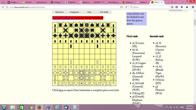
Chu Shogi ('Middle Shogi') has been the dominant form of Chess in Japan for many centuries, until the
Or is your screen so narrow that it doesn't display anything right of the diagram at all, and gives the piece list entirely below it? This would also be fatal for the design of the page, btw: it is essental that the piece list is in view together with the diagram, because clicking on the piece name would show its moves in the diagram, and if that diagram is off-screen it completely defeats the purpose.
I added the code class="legend" to the table that contains the list of pieces in the Chu Shogi diagram, and then I used this class in global.css to reduce font-size and line-height to their initial value, to move the list-items to the left, to reduce margins and padding, and to made each TD use less space by positioning its content at the top. The result is that the whole list of pieces fits beside the diagram, and using a larger font for the article text will not affect this. You can use the same class for any other table of the same sort.
Serif / sans-serif is OK, but what you had was a weirdo font that would leave you cross-eyed if you would have to read an entire page of it.
Since it wasn't a body font, that's not really an issue. I thought it looked good for some pages, but the medieval style didn't feel right for every game, and it didn't feel right for headings below the game description, such as Credits or Comments.
What you have now is at least a neutral typeface without any unnecessary curves and corners, and is much, much better IMO.
I agree. I really like Catamaran. It is much more neutral, similar to Helvetica or Arial, which makes it more suitable for a wider variety of games and headings. I also like that it more distinctive than Helvetica or Arial, and it seems appropriate that this font, like Chaturanga, is of Indian origin.
To give some typographic options for those who care about it, I have preceded the Google body fonts (Tinos, Lusitana, and Volkhov) with
"TeX Gyre Schola", "Tex Gyre Bonum", "Tex Gyre Termes", "Tex Gyre Pagella",
These are free, high quality replacements for Century Schoolbook, ITC Bookman, Times, and Palatino. All are part of the TeX Gyre project. If you like one of these, you can install it on your computer, and this site will display body text with it.
I found out last night that the browser on my Kindle Touch can use the fonts I have put on my Kindle for reading books. With that in mind, I began the list of fonts for widths of 1239 and below with Malabar, which is the main font I use to read books on my Kindle. This font is actually found on the Nook, a rival ereader from Barnes & Noble, but since I have both, I copied the Nook's fonts to my Kindle. I did not include Malabar in the list for larger screens, because it seems too dark and heavy for the big LCD screen.
I also broke the 1 to 1239 range into two ranges: 1 to 599 and 600 to 1239, so that I could use a larger font on my Kindle than is needed on my phone. I will eventually turn to checking out the typography on tablets.
I also added CSS to make the <Q></Q> tags use curly quotes. You can use these for quotations in prose that is meant to be read by people. Straight quotation marks should be reserved for computer code.
I initially resisted using Georgia, because it is a system font. But it is a really good font, and I decided to place it at the beginning of the list of fonts. I also grew tired of Catamaran and placed the even more neutral Segoe UI in front of it, this being the font I already use for the menu. I dropped the font-size from 20 to 18, because fonts other than than EB Garamond seemed too large at that size.
H. G. Muller wrote on Wed, Oct 4, 2017 07:31 AM UTC:I dropped the font-size from 20 to 18, because fonts other than than EB Garamond seemed too large at that size.
This is indeed much better.
It can be hard to find just the right font. Tinos was beating other fonts in legibility, but it was also plainer looking than the competition. One thing I noticed about it was that it seemed to have more space between lines. So I slightly increased the line-height with fonts that looked prettier and got improved legibility. I tried various fonts, often finding something or other wrong with them. PT Serif was looking good for a while, but it had an ugly capital Q. Cormorant Garamond had a Q with a long tail that reached under the next letter. That might look fine when it is always paired with a u, but it doesn't work for the letter Q by itself as an abbreviation for Queen. Crimson Text had faint quotation marks. There are more I could test, but for now, Spectral looks like a good choice. It seems to have a good balance between legibility and prettiness without having any weird looking letters or different sized numbers.
H. G. Muller wrote on Wed, Oct 4, 2017 03:16 PM UTC:What's this?
I do have a 900px wide table on that page (500 + 400-wide cells), but that shouldn't force the width of the text so large as it is here, on my 1366px-wide screen. And that table is hidden.
I don't know why that would happen. I have been trying out different fonts today, but that shouldn't cause that to happen.
Curiously, the Donate button on the interactive-diagrams page is much bigger than on other pages, which suggests there is something different about the CSS on that page. I also got some overlap between the ad and the page content when I sized that page's window small enough, but I can't duplicate this for other pages. So, you should check whether you are doing anything to the CSS on this page that would cause this overlap.
H. G. Muller wrote on Wed, Oct 4, 2017 03:40 PM UTC:Well, it was still OK a few days ago, and I did not change the text for quite some time, when went through the page to upload new graphics. So it must be something in the global settings or the display script, controlled by you. This is another indication that it cannot be due to the width of the hidden tables; they weren't too wide before.
The final step of the Design Wizard (after pressing 'Show HTML') now also has become a disaster: the box showing the HTML (a 1x1 table) is now so wide that it completely crushes the diagram on the left.
In case it helps, the window width at which I got the overlap is 1352px, and the viewport width is 1338px. The left ad normally displays in the width range of 1331px to 1535px. The narrow right ad displays in the range of 1240px to 1330px. Below a width of 1240px, the sidebar ads do not display at all.
It seems that the font I was currently trying out arranged your text in a way that caused the article width to be wider than the value max-width had been set to. So I just moved on to trying a different font.
Here are characteristics I want in a body font:
- Each character is self-contained in its own box. For example, the tail of the Q should not extend underneath other characters.
- The line in the e should be horizontal. So, garalde old style is preferable to humanist old style.
- The letters l and h should not be especially taller than capital letters. Words like All and The shouldn't have capitals letters significantly shorter than the letters that follow them.
- Letters should not have thick vertical lines and thin horizontal lines like modern or didone fonts do. So, old style and transitional fonts are to be preferred.
- Letters should not be too fancy or too plain.
- Letters should be easily legible, and reading lines of text should proceed quickly.
- Letters should not be too heavy or too light.
- Numerals should be the same height as each other.
- It should ideally include multiple styles and weights.
- Letters should not be too wide or fat.
- Apart from acenders, lowercase letters should be the same height. The letters d and b should not have lower parts that are taller than an e. The letter c should not be taller than r.
I have been trying out different fonts, but I'm taking a break now. The current body font is Tienne by Vernon Adams.
H. G. Muller wrote on Wed, Oct 4, 2017 04:49 PM UTC:Add:
Digits should be taller than letters, so that things like "12x10 board" aren't difficult to read.
The current font fails in this respect. It even has some digits (such as 5) stick out beneath the baseline.
BTW, the overlapping ad seems to be cause by long lines in a <pre> element forcing the text to be wide enough to contain them. And they got longer because of your larger fonts.
The screen is of course wide enough to contain these lines, but it insists to waste a few hundred pixels on a wide left margin, because some 5 screen sizes above it there is this annoying ad, using the upper 5% of the ASIDE side bar. And on screens smaller than 1331px, the side bar is gone, but the (vertically oriented) ad is displayed in a (horizontal) header, forcing you to first scroll down two screens before you can see any of the true content of the page.
I don't understand why you bother with typography while the overall layout of this website still so utterly sucks...
Add:
Digits should be taller than letters, so that things like "12x10 board" aren't difficult to read.
Yes, that seems important.
I don't understand why you bother with typography while the overall layout of this website still so utterly sucks...
You have to avoid hyperbole and remember that your perspective is not mine. If you are dissatisfied with something, you should provide a detailed bug report, not vent your emotions.
The current font is one called Average. The Q's tail goes underneath the next letter a little bit, but it is not too bad. This has only one style. So italics is just slanted. Here is some boldface. It otherwise seems to fit my criteria.
Average and Malabar look so much like each other, I couldn't tell that the font was changing when I resized the window. I had to meticulously compare their characters, find some that were different, then enlarge the text enough to make comparisons. When comparing them at the same size, I can see that Malabar is bigger and darker, which makes it good for the body font on mobile devices, but not so good for it on desktop monitors. Since Malabar has been my main font for reading books on my Kindle, its resemblance to the lighter, smaller Average is a good reason to stick with Average on the desktop. [Note: Unless you have Malabar installed, you will see Volkov when you shrink the window.]
H. G. Muller wrote on Wed, Oct 4, 2017 07:36 PM UTC:If you are dissatisfied with something, you should provide a detailed bug report, not vent your emotions.
Well I thought I did. Let me try it with a (window) screenshot then:
When the viewport is too narrow for the left side bar (as on my Linux VM), the first two screenheights of every page have no content, just ~70% blank space and ~30% ads, and you have to scroll down two screens to even see what the page is about. Because an ad is placed in an area with a completely wrong aspect ratio for it. I do't see why we would need an extra ad above the article content: there already is one above the menu bar (fortunately of a more suitable shape).
Apart from this being very annoying when you switch between pages, it also creates a large distance between the menu bar and the place where you have scrolled to when you want to use it. I think it is pretty ridiculous that there is anything between the menu bar and other content. The whole idea of having a menu bar is that it should be in easy reach. So if displaying adds has so much priority over displaying content that multiple screenheights of advertizement are a necessity, the menu bar should at least be below it, near the actual content.
H. G. Muller wrote on Wed, Oct 4, 2017 08:42 PM UTC:This is also very sloppy:
Why does the header ad jump to below the logo at this total width. There seems to be plenty of room to display it. And if not, it should shrink rather than jump.

I cannot replicate this, but this is what I would expect to happen if the globalindex.css file wasn't loaded and working. Have you done anything to disable or interfere with this site's CSS? If not, I need precise details on the conditions under which you find this happening.
The top banner shares the space with the logo and the share widget, and it will jump down if squeezed out. For what's happening in the other picture, I will need precise details on the conditions under which it is happening. This includes the browser, the OS, the screen width, the window width, the viewport width, and anything going on that could be affecting the CSS.
H. G. Muller wrote on Thu, Oct 5, 2017 08:21 AM UTC:The top banner shares the space with the logo and the share widget, and it will jump down if squeezed out.
Well, that sucks. Page banners are not supposed to do that. Especially since in the shown case the banner is not 'squeezed out' at all: there is plenty of space to display it. The technical reason for it to happen just shows the poor design. If you want the layout of the header to change under width-pressure, it would make more sense to move the share widget to under the logo, as the banner is usually higher than logo and share widget together. Using floating style is just the wrong techology for formatting page headers. The elements should be forced to stay side by side, and in extreme cases shrink to fit or summon a horizontal scroll bar.
For what's happening in the other picture, I will need precise details on the conditions under which it is happening. This includes the browser, the OS, the screen width, the window width, the viewport width, and anything going on that could be affecting the CSS.
Well, I don't mess with the CSS, and it is very surprising you cannot reproduce this effect.It is not like I have to go looking for these things; they jump you all the time when using this website. The "ad below menu bar" happens on every page except some submission forms (which have no ads, header and menu bar at all), whenever I narrow the viewport to the point where the left side bar closes. It doesn't seem dependent on the OS or browser used, (the screenshot was taken with FireFox 10.0.1 on Ubuntu Linux, and the viewport size should follow from the image width, which is demagnified by a factor 2), and is likely caused by faulty or missing style definitions for the side bars in the various width ranges where they occur.
The relevant part of the 'Page Source' causing the "large white space" screenshot is below, and the page looks just like what you would expect if there isn't a special style definition for the rightcol or leftcol ASIDE; it would just display it above the ARTICLE, as that is where it appears in the source:
<DIV CLASS="middle">
<ASIDE CLASS="leftcol">
<script type="text/javascript"><!--
amazon_ad_tag="chessvariants-20";
amazon_ad_width="300";
amazon_ad_height="250";
amazon_color_background="EBECDF";
amazon_color_border="AFA938";
amazon_color_logo="504706";
amazon_color_link="2B5A6B";
amazon_ad_logo="hide";
amazon_ad_title="The Chess Variant Pages Gift Shop"; //--></script>
<script type="text/javascript" src="http://ir-na.amazon-adsystem.com/s/asw.js"></script><script language='JavaScript1.1'>
document.write("<sc"+"ript language='JavaScript1.1' src='http://rover.ebay.com/ar/1/711-53200-19255-217/1?campid=5337821335&toolid=7115320019255217&customid=&mpt=" + Math.floor(Math.random()*999999999999) + "&adtype=3&size=300x250&mpvc='></sc"+"ript>");
</script>
<noscript>
<a href='http://rover.ebay.com/rover/1/711-53200-19255-217/1?campid=5337821335&toolid=7115320019255217&customid=&mpvc='>
<img border='0px' src='http://rover.ebay.com/ar/1/711-53200-19255-217/1?campid=5337821335&toolid=7115320019255217&customid=&mpt=[CACHEBUSTER]&adtype=1&size=300x250&mpvc=' alt='Click Here'>
</a>
</noscript><SCRIPT>
if (window.canShowAds === undefined) {
document.write(`<FIGURE>
<FIGCAPTION>Musketeer Chess Fortress and Unicorn Kit Bundled with HOS Luxury Plastic Chess Pieces</FIGCAPTION>
<A HREF="http://www.houseofstaunton.com/unicorn-and-fortress-chess-kit-with-black-natural-plastic-pieces.html?___store=houseofstaunton_en&acc=eb163727917cbba1eea208541a643e74"><IMG SRC="http://www.houseofstaunton.com/media/catalog/product/cache/3/small_image/267x240/9df78eab33525d08d6e5fb8d27136e95/m/a/marshall-overlay_4.jpg" ALT="Musketeer Chess Fortress and Unicorn Kit Bundled with HOS Luxury Plastic Chess Pieces" TITLE="Musketeer Chess Fortress and Unicorn Kit Bundled with HOS Luxury Plastic Chess Pieces"></A>
</FIGURE>
<FIGURE>
<FIGCAPTION>Musketeer Chess Dragon and Spider Kit Bundled with HOS Luxury Plastic Chess Pieces</FIGCAPTION>
<A HREF="http://www.houseofstaunton.com/spider-dragon-chess-kit-with-black-natural-plastic-pieces.html?___store=houseofstaunton_en&acc=eb163727917cbba1eea208541a643e74"><IMG SRC="http://www.houseofstaunton.com/media/catalog/product/cache/3/small_image/267x240/9df78eab33525d08d6e5fb8d27136e95/m/a/marshall-overlay.jpg" ALT="Musketeer Chess Dragon and Spider Kit Bundled with HOS Luxury Plastic Chess Pieces" TITLE="Musketeer Chess Dragon and Spider Kit Bundled with HOS Luxury Plastic Chess Pieces"></A>
</FIGURE>
`);
}
</SCRIPT>
</ASIDE>
<ASIDE CLASS="rightcol">
<iframe src="//rcm-na.amazon-adsystem.com/e/cm?o=1&p=14&l=ur1&category=topgiftideas&banner=1PS7NTZH9Z597A9KKWR2&f=ifr&linkID=dba816b2b2d0685889719280db7301d6&t=chessvariants-20&tracking_id=chessvariants-20" width="160" height="600" scrolling="no" border="0" marginwidth="0" style="border:none;" frameborder="0"></iframe></ASIDE>
<MAIN>
<ARTICLE>
H. G. Muller wrote on Thu, Oct 5, 2017 12:39 PM UTC:Here is another (rather extreme) example. This time from FireFox 55.0.3 (32-bit) on Windows 8.0, with a 1366px-wide screen (maximized window). I glued 3 screenshots taken at different scrolls together:
It seems like two ads, partially covering each other, are inserted between the menu bar and the article text. Likely the upper one is the "leftcol" ASIDE, and the lower, narrower one the "rightcol" ASIDE.
The page http://www.chessvariants.com/d.betza/chessvar/index.html had an incorrect link to the style sheet. This page was two directories deep, but the link went back only one directory. This is now fixed.
It appears that the comments page currently has some content on it that prevents the main section from growing narrower. I don't know if there is a way to test for this in CSS.
H. G. Muller wrote on Thu, Oct 5, 2017 03:59 PM UTC:The page http://www.chessvariants.com/d.betza/chessvar/index.html had an incorrect link to the style sheet. This page was two directories deep, but the link went back only one directory. This is now fixed.
I was wondering about this, because seeing two ads was a-typical. I still see one ad, though, in the submission form I am now typing in...
The problem with linking can be prevented by avoiding relative path names in intra-site links. Nowadays I always use "/membergraphics/MSinteractive-diagrams/betza.js" for the link to the JavaScript in interactive diagrams, because the "../membergraphics/..." did not work for some subjects deeper in the tree (I think it was Centennial or Omega Chess). And when you view them in isolation you are one level from the root.
BTW, I noted that page sources tend to be very bloated. There is always an enormous amount of JavaScript related to the menus, which furthermore is full of intra-site links that also has the server URL in it. If you ever want to reduce the bandwidth this site consumes (by a factor 10 or so), this would be a good place to start.
It appears that the comments page currently has some content on it that prevents the main section from growing narrower. I don't know if there is a way to test for this in CSS.
What can that be? The screenshots I posted are not that wide, this is why I demagnified them. The page source I posted as normal text, so that is can be wrapped over lines at any space. For me the text width just adapts when I narrow the window, until I try to shrink it below the width of the screenshots. Then a horizontal scroll bar appears.
68 comments displayed
Permalink to the exact comments currently displayed.
I'm working on improving the typography, and I could keep on trying things, but it's time to turn off the computer. For now, the body text is 20px EB Garamond, and the headings are in Germania One. These might change tomorrow. I might use Germania One only for top headings and use a grotesque font for lower headings. I will be trying out more font combinations tomorrow. Note, these changes are only in global.css so far, not in globalindex.css. So they only affect regular pages, not index pages like the one you're reading this on.