Comments/Ratings for a Single Item
Okay, check the next two links on that page. For these, I have split global.css into two parts. One uses front.css, and the other uses tail.css.
Hi Fergus.
I had no problem with the first of the next 2 links you asked me to try. However, the 2nd such link caused a crash.
That's curious, as the new css is mostly in the first one. I'll try to narrow it down further tomorrow.
I have now placed new CSS files in the next two.
"Getting More Data" uses front2.css, which has the code from front.css with some from tail.css.
"Impossible by Definition" uses tail2.css, which has the rest of tail.css.
@ Fergus
'Getting More Data' link causes a white page plus crash, on my iphone (you didn't mention it, but I also checked 'Mobility...' link before that link, and that link worked okay for me).
'Impossible by Definition' link worked okay for me, on the other hand.
I removed what I think is the offending code from global.css and globalindex.css, and I purged these from the cache. So try the homepage again, and bear in mind that you may have to refresh your browser cache. Also, I have used globaltest.css on "Summary of Part 1". This is a copy of the updated global.css under a different filename to guarantee it is not using the old version.
Using Safari's address bar on my iphone,
chessvariants dot com resulted in a white page plus crash.
When I tried the link 'Summary of Part 1' (in Betza article), again a white page plus crash happened.
Okay, "References" uses front3.css, and "Thought Experiment" uses tail3.css.
For these, I just slightly adjusted what was in front2.css and tail2.css.
The link 'References' caused a white page and crash on my iphone. However, the 'Thought Experiment' link worked for me.
Okay, I removed the only other CSS that could be causing the problem from global.css and globalindex.css, and I created a new copy of global.css called globaltest2.css, which I linked to in "Personal Variations". Try the homepage again, refreshing the cache if you need to, and this page.
The link chessvariants dot com again resulted in a crash (I did it on Brave as well as Safari on my iphone, in case I didn't refresh my cache properly on Safari).
The 'Personal Variations' link (from Betza article) caused a white page plus crash, when I clicked on it while using Safari.
I found another point where I could divide global.css into two files. So now "Point Count Chess" has front4.css, and "Quantum of Advantage" has tail4.css.
Hi Fergus
Those links both worked. Even better, at this time tonight I can get to the CVP homepage now. I shall try to explain what I think might have caused the whole problem with my iphone, regarding CVP site at least:
Earlier tonight I went to my usual local bar. A friend with an Android phone was there and he got to the CVP homepage no problem, When my iphone still failed to get there without a crash, he suggested I check my phone for updates. He then started one that was waiting on my iphone for me, just by getting me to agree to the update terms (hopefully it's completely free of any new $ charges to me).
That apparently started to make my iphone into a version 17.something (cannot recall exact decimal number of version), finishing up by soon after I got home, when I took my phone out of my pocket. Then, unlike a previous time I had a similar update done to my phone's version, my phone asked me for my house's Wifi's password (don't know if that's unusual or just new with this iphone update version - hopefully I won't need to bother to re-enter Wifi passwords, for use in the two bars I go out to). After that I soon had my iphone seeming to look about the same as before on its screen - except now I seem to be able to get anything on CVP site, so far, no problem, at least with Safari or Google search.
I made a couple changes to the dark theme logo.
- I replaced the Knight/Camel piece, which had represented the Pushmi-Pullyu, with the new Ram/Ox image for that piece.
- I removed the stuff hanging around the waist of the fairy princess. In an earlier version of the image, this had been long hair. Thanks to some changes I made to a source image I used to produce new images, she became short-haired. The stuff around her waist could be interpreted as cloth hanging from her sleeves, but it seemed a bit weird and out-of-place.
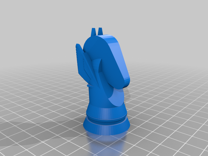
Or we are several people designing Staunton-like 3D pieces for printing. Importing a .stl into Meshmixer we could make very nice 2D images.
Those are suitable for going on individual Piececlopedia pages if someone would like to take charge of that. I'm not the one to do that, since I don't have a 3D printer or know anything about the image formats.
I nominate Jean-Louis. ;)
I don't think he is interested. Would you be interested in doing that? As the person who has made the most pieces for 3D printing, you would be more qualified than the rest of us to handle this. If you're familiar enough with HTML, I could set you up as an editor and give you the ability to update pages.
I don't think he is interested. Would you be interested in doing that? As the person who has made the most pieces for 3D printing, you would be more qualified than the rest of us to handle this. If you're familiar enough with HTML, I could set you up as an editor and give you the ability to update pages.
I mostly was kidding re: Jean-Louis.
As for me doing it, I might be willing, but I'll need to look into what I can find in the way of zero-cost tools. (Now pardon me while I run off to search.)
 H. G. Muller wrote on Mon, Mar 25 03:46 AM EDT in reply to Bob Greenwade from Sun Mar 24 06:45 PM:
I don't think it is a good idea (to put it mildly) to have computer-generated images of pieces in the piececlopedia. Photographs of actual 3d-printed designs might be another thing; if we would also publish a link to a file people could use to 3d-print those themselves these would serve a purpose. Many of the virtual pieces I have seen here are unacceptably ugly, fragile, or unsuitable.
I am on the same line than HG. I was thinking of creating a page for a "catalog" of the pieces I have designed for 3D-printing. I have printed all of them, some several times in order to be fully satisfied.
Would that be useful?
If yes, I imagine I have to follow the same process than when creating a page for a new variant?
I do think that would be a good idea. If I can get my 3D printer working again, I may do the same.
I think it'd be done as an "other" kind of page -- create it like a game page, with a note to the Editors.
Aside for the Editors: I think it might be helpful to have a form specifically designed for these more "generic" pages.
I don't think it is a good idea (to put it mildly) to have computer-generated images of pieces in the piececlopedia. Photographs of actual 3d-printed designs might be another thing; if we would also publish a link to a file people could use to 3d-print those themselves these would serve a purpose.
I am happy to include 3D printable pieces. However, I am not going to dismiss AI art because it can't be fed into a 3D printer to produce physical pieces. Production is not the only purpose of art. It also serves the purpose of stirring the imagination and helping people think about what is possible.
Many of the virtual pieces I have seen here are unacceptably ugly, fragile, or unsuitable.
You're welcome to criticize individual images, but I will not consider a broad, subjective opinion like this as a reason to give up on a new artistic tool. It's not as if I just give it a prompt and upload whatever it draws. I carefully select the best images I get from AI, and of late I have been fine-tuning images by using altered images to give it a better idea of what I want.
Well, I completely disagree with you Fergus. AI art is not art at all.
Well, I completely disagree with you Fergus. AI art is not art at all.
To an extent it is not, sort of like evolution by natural selection is not design, yet both get results. I approach the creation of AI art like evolution. I have an idea of what I want, and I use AI art as a tool to produce the kind of image I want to create. If it doesn't give me what I want right away, then I try again, sometimes changing the text prompt, or the model, or the source image I give it to tell it what to draw, or other parameters. Evolution by natural selection gets results, because despite the randomness of mutation, it applies a strict selection process to the mutations that get passed on and those that don't. Like mutation, the results of AI art are not entirely in my control. But like natural selection, I apply a strict selection process to what I get. And unlike natural selection, I actually have creative visions behind what I'm doing. So, while it is not the traditional creative process of an artist exercising total control, it is a creative process in which I do exercise control. Besides making images of Chess variant pieces, I have used AI art to produce album covers for playlists I have made featuring covers of tracks from particular albums. On my Pinterest board for My Spotify Playlists, I made every cover except the two collage covers with AI art.
@Fergus: your answer is so personal, I have no doubt that you find a great satisfaction in making those images. The "approach of creation" you describe is very natural in fact. I'm surprised by your self-estimate.
I follow exactly the same path when I create 3D pieces or, even, when I write. I do, change, re-do, re-change, re-write, re-draw until I get satisfied. And we are probably tens of people here doing that in our hobbies, painting, sculpting, composing music, etc. Call it creation, call it art, what matters is the result. Appreciating the result is certainly personal also. Here we are talking about the representation of chess variant pieces, not about getting a nice-looking images. My opinion is that you got very nice results in some cases:
The Dragon on the Dark Welcome Page is very sophisticated, but it does look as a very nice chess piece. The Advancer in the Piececlopedia is excellent. As well as the Antelope. The Camel, the Wildebeest are OK.
Now, I don't like at all the Princess on the Dark Page. First not sure that a Princess is a good target, a name that we rarely use nowadays for CV, second the shape, it won't stand on a board, and last not least, why representing a princess with wings? Princess with wings, this is a Disney cartoon cliché.
The Centaur just looks as a female centaur on a base. A nice female centaur maybe but this is not a chess piece. Similar critic for some other pieces.
I follow exactly the same path when I create 3D pieces or, even, when I write. I do, change, re-do, re-change, re-write, re-draw until I get satisfied. And we are probably tens of people here doing that in our hobbies, painting, sculpting, composing music, etc. Call it creation, call it art, what matters is the result. Appreciating the result is certainly personal also. Here we are talking about the representation of chess variant pieces, not about getting a nice-looking images. My opinion is that you got very nice results in some cases:
Thanks, I appreciate that you understand that.
The Dragon on the Dark Welcome Page is very sophisticated, but it does look as a very nice chess piece.
It's a Dragon Horse, not simply a Dragon, and it is probably based on a Japanese work of art representing one. I have seen a similar, though simpler, version of this image used in an iconographic Shogi set.
Now, I don't like at all the Princess on the Dark Page. First not sure that a Princess is a good target, a name that we rarely use nowadays for CV
Does fairy chess ring any bells? As I've mentioned on this page and in an earlier comment to you, this piece represents fairy chess. That's why it's a fairy. It could have been an empress as easily as a princess, as each is a fairy chess piece that could be made to resemble a queen. In fact, I have an earlier comment that shows one possible logo with an empress instead of a princess. These two fairy pieces were my main choices, as fairies are usually represented as girls or women with butterfly wings.
it won't stand on a board
I think you're imagining that the piece is uniformly made of a single material like a 3D printed piece might be. With a heavy base and light wings, there is no reason it shouldn't stand on a board.
Princess with wings, this is a Disney cartoon cliché.
Can you name a single Disney princess with wings? Tinkerbell and the Blue Fairy may have wings, but they are not princesses. Snow White, Cinderella, Sleeping Beauty, Jasmine, Rapunzel, the one from The Princess and the Frog, and the two from Frozen are all humans without wings.
The Centaur just looks as a female centaur on a base.
The Centaur is male. I think you're making the same mistake you made before of confusing the source image with the final result. I explicitly explained that the female image I posted in a comment was a source image I used to begin a series of generations that resulted in the male centaur used on the page.
A nice female centaur maybe but this is not a chess piece. Similar critic for some other pieces.
There are figurine Chess pieces, and it is hard to represent a centaur with a piece that does not show its lower body, as a centaur's distinguishing feature is the difference between its upper and lower body.
Well, I don't learn all past comments by heart, and I confess I often don't understand what you write here or there.
What I know is that Fairy chess is a term that we use in // to chess variant or non orthodox chess, etc. It doesn't mean a chess with fairies. I know plenty chess variants, I know none with fairies.
Fairies or princesses, I'm not going to spend time to discuss Disney movies. Everyone has got what I meant, the rough idea. When my daughter was <8 years she was playing with little fairies or princesses some wings. That is not a symbol I was expecting to see on this site. But you never change your mind, you prefer to argue like a lawyer and I don't have the skills in English to sustain this discussion.
And I know what a centaur is. I have some education. I even took the challenge to represent one in 3D with the bottom of a knight and the top of warrior. My result is not a cute as your figurine but at least it looks like a chess piece in the same manner that a Staunton knight looks as a chess piece and not as a horseman figurine.
I think it might be helpful to have a form specifically designed for these more "generic" pages.
I have updated the submission scripts to handle other types of pages. This can be done with the Type field, which now includes all types. When its value is something other than Game, it provides only the first text field, which is normally used for the Introduction of a game. This field now has the database type of LONGTEXT instead of TEXT, which should be more than enough space for any file.
Awesome! Good job!
you never change your mind
I do change my mind, and you even helped persuade me to remove the frog and an earlier fairy princess. But there are also matters on which I will stand my ground.
What I know is that Fairy chess is a term that we use in // to chess variant or non orthodox chess, etc. It doesn't mean a chess with fairies. I know plenty chess variants, I know none with fairies.
As a fairy, it's a symbolic representation of fairy chess in general, not a literal representation of a particular fairy piece. As a princess, though, it is a literal representation of a particular fairy piece, and the fairy wings help indicate that this is the princess of fairy chess rather than the princess of Jetan or some other game with a princess. They also serve the purpose of distinguishing this piece from a queen, since the pieces flanking the logo should resemble usual Chess pieces without being mistaken for them.
Fairies or princesses, I'm not going to spend time to discuss Disney movies. Everyone has got what I meant, the rough idea. When my daughter was <8 years she was playing with little fairies or princesses some wings.
One thing I appreciate about this logo is how it balances the masculine and the feminine. The dragon horse is fiercely masculine, and the princess is gently feminine in a way that helps tame the ferocity of the dragon horse. While it is natural for little girls to be more into feminine things like princesses and fairies than boys are, it is also natural for men to appreciate what is feminine. It has become a cliche for both knights and dragons to be into princesses, and John Carter, a masculine pulp fiction hero, is known for his devotion to Dejah Thoris, a princess of Mars. As a straight male, I find that femininity is something I like about women, and it is something I want to see in the portrayal of a female Chess variant piece. Also, perhaps because I grew up with Brian Froud's Faeries book, I have long had an appreciation for fairies that has nothing to do with Tinkerbell. Disney may do what it can to capitalize on the love little girls have for fairies and princesses, but it does not have a monopoly on either concept, and I have not drawn on Disney representations to create this piece image.
And I know what a centaur is.
I never meant to imply otherwise. I was just pointing out the difficulty in portraying one in something short of a figurine piece.
I even took the challenge to represent one in 3D with the bottom of a knight and the top of warrior. My result is not a cute as your figurine but at least it looks like a chess piece in the same manner that a Staunton knight looks as a chess piece and not as a horseman figurine.
I look forward to seeing what is looks like when you create a page for your pieces. Things are now set up that you should now be able to do so. But let me know if you need to upload file formats that are not currently supported, as I remain unfamiliar with file formats for 3D printers and have not yet included support for uploading them in the File Manager.
Much time passed, but still. On dark theme.
Indigo font on brown/dark-grey/purple background is hardly readable. Blue is just slightly better.

I suggest dividing font colors for light and dark modes further. Links’ colors in info boxes are possible solution.
Much time passed, but still. On dark theme.
Indigo font on brown/dark-grey/purple background is hardly readable. Blue is just slightly better.
It's not like I've known this to be a problem and have just done nothing about it. Different browsers have different capabilities, and if what seems like an obvious problem to you goes on for a long time without being fixed, this could be because I am not experiencing the same problem as you are.
This particular problem is probably because I am using color-mix for the link colors instead of custom properties like I am for all the other color changes, and custom properties have better support than color-mix. So there may be an occasional browser that supports custom properties without supporting color-mix. However, I have not been able to locate one. While I have some old devices with old browsers that do not even support dark mode, every browser I have found to support dark mode supports it fully with both custom properties and color-mix.
So, first, I would like you to report to me which version of which browser on which operating system or device has this problem. Then I would like you to make sure everything is up-to-date. Make sure that your device is fully updated and that your browser is the latest version. After doing this, let me know whether the problem persists.
I made the following changes to the color schemes:
- I replaced the uses of color-mix for the link colors with custom properties using values calculated by color-mix in Firefox. For the dark scheme, these are equal mixes of white with blue, indigo, or green, the same as they were before. For the light scheme, the mixes used 75% blue, indigo, or green and 25% black, as the equal mixes seemed too dark, and the unmodified colors seemed too bright.
- For comments, I changed the color of the line for displaying a page title from --nav-border-color to --nav-highlight-color, as olive was giving me a queasy feeling in combination with the link colors in the light scheme.
- I also changed the color for the vertical bar on blockquotes to the same color to match.
- For the dark scheme, I switched the values for --nav-border-color and --nav-highlight-color. This returns the two things mentioned above to the color they were before. Since the new nav highlight color is now lighter, it is standing out better against dark backgrounds.
I also changed the color for the vertical bar on blockquotes to the same color to match.
Since I didn't like how light this was in the light scheme, I considered other colors than darkkhaki for --nav-highlight-color, but I kept coming back to darkkhaki for that. So instead I looked for another custom property to use for the color of the vertical bar, and after trying out currentColor, I settled on --visited-link-color. I like how it stands out in each color scheme, and previous comments usually share the feature with visited links of being previously read.
I have two unfinished submissions, but when I try to edit either of them I see "Since this is not a Game Rules page, please move any content here to the top section."
They are both meant to be Game Rules pages, so could someone fix that?
I have two unfinished submissions, but when I try to edit either of them I see "Since this is not a Game Rules page, please move any content here to the top section."
They are both meant to be Game Rules pages, so could someone fix that?
I'm getting the same thing on several of my pages.
Both of you, please list specific pages this is a problem on.
Works-in-progress:
Tifinagh Soup
Dai Dai Kagamigi
Unnecessarily Complicated Chess on a Tesseract
Greater Dragon Wars
Drunken (K)nights
Awaiting Review:
Unnecessarily Complicated Chess
Monster Mash
Xodohtro Chess (formerly Unorthodox Chess)
I haven't checked my already-published games yet, but since only one game page of the above two types (Clue Chess) isn't experiencing this, I think it's likely happening with them too. In other words, a system-wide problem.
Analogically. For any my submission.
So, first, I would like you to report to me which version of which browser on which operating system or device has this problem. Then I would like you to make sure everything is up-to-date.
Safari. iOS 15.8.2 is the latest available for my device.
Oh yeah, main and listing pages are fine. They’re the first pages which bring changes.
I temporarily made myself the co-author of one of your pages to get the link you get for editing the page. I had introduced a new line using the variable $type, but the rest of the script was using $itemtype for the value of Type. So I changed the variable name, and it started working correctly.
Well, it seems to be working fine for me now. :) Thanks!
My iPad has iOS 17.4.1, but I do have access to an old iPhone with iOS 15.8.2. The dark scheme partially works on it, but I see that the logo is not changing. It shows the elephant and unicorn logos instead of the dragon horse and (fairy) princess logos even when it is in dark mode. By substituting an older CSS file in index.html, I could tell that color-mix was not working, and blue but especially indigo did not contrast well with the dark background. I found this iPhone had the same problems in both Firefox and Chrome. At least using custom properties instead of color-mix has fixed the problem with the link text color.
To get the logo to change, I tried using the <picture> tag. As I feared, it would not work unless dark mode was selected at the browser level. This is why I normally use CSS to switch the logo. Chrome and Safari did not provide me any means to select dark mode at the browser level, though Firefox did. But when I selected dark mode in Firefox at the browser level, it wasn't working. Using test pages, I got it to work for browser selected dark mode by removing a test using :not. But doing this disabled the ability to select the light scheme from the menu when the browser's dark mode is turned on. I tried to fix this, and while my fix works on my desktop, it does not work in the Firefox app on this iPhone. So, I have no solution for getting the right logo to show up on this older iPhone that would work equally well with both methods of selecting the color scheme.
Perfect!
Could I have the ItemID of this page changed to match the changed title?
I have made the controls for changing the color scheme more accessible. They appear on the right of the menubar in desktop mode, and they appear at the bottom of the menu on mobile devices.
I modified the Dark color scheme to use a darker color for the text that works well with the chocolate background color. This is to make reading more comfortable on brightly lit screens. However, it was too low contrast on my Likebook Mars.
So I have added a new high contrast color scheme called Darker, represented by the New Moon emoji in the color scheme selection form. This is intended mainly for eink devices for which the Dark color scheme may be too low contrast, though you may still use it on other devices if you prefer it. In general, its background colors are darker, and its text colors are lighter. For the main background and text, it uses black and white. Unlike the Light and Dark color schemes, this one is not available through your browser settings. It is available only by selecting it on the website, and you may have to refresh your cache before it starts working.
And now in brown Dark mode text is light-brown instead of white!!!
However, main page and lists are not disturbed. It means that then entire site will work normally.
I did not use the darker text color in globalindex.css, which the homepage uses, because it is mainly intended for making it easier to read long passages of text, which the homepage and other index pages do not have. It should affect text in lists if they are not links, but all the examples you gave of lists were filled with links. If you prefer a more high contrast display with white text on a dark background, you can use the Darker color scheme.
For me, light brown text in brown Dark mode is significantly less readable. And comments’ text is still white and readable.
For me, light brown text in brown Dark mode is significantly less readable.
That's going to vary with the device and the person. That's why there is now a third color scheme.
I have updated PHP to 8.1.28, and I will be going over the error logs for things I have to change to keep up with this new version. If anything stops working, let me know.
Ah, forgot to say. Color scheme changes’ saving doesn’t work!
No, it works, but sets darker mode when turning to dark and vice-versa.
Yes, the saving worked, but when writing the form on mobile, it was using the wrong condition to add " SELECTED" to the darker option. That's now corrected.
That's now corrected.
I see
And maybe you’ll make text in brown dark mode if not whiter but bit brighter?
I have now updated Mobile Detect to 4.8.06. Since it works differently than the old version, mobile detection was a bit wonky until I got it working correctly.
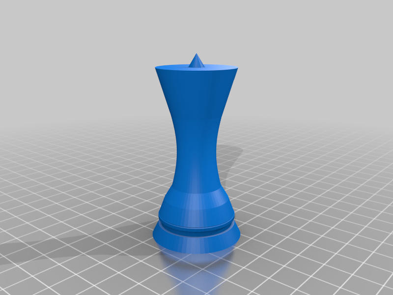
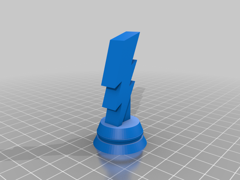
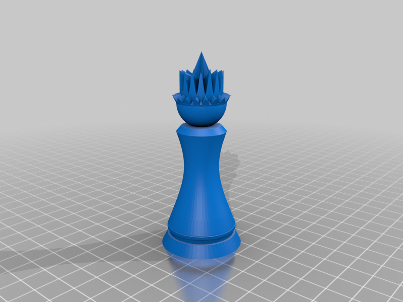
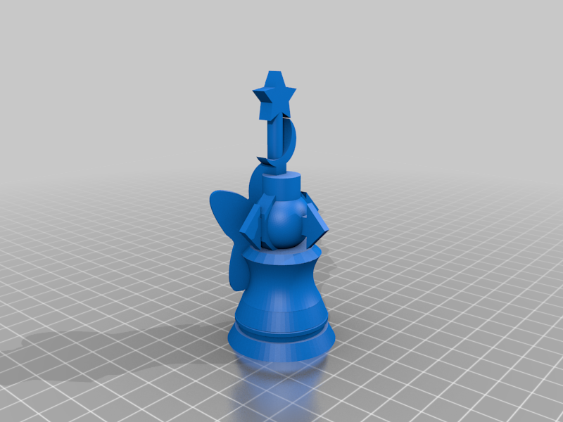
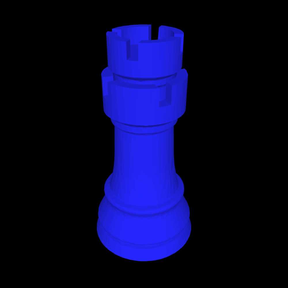
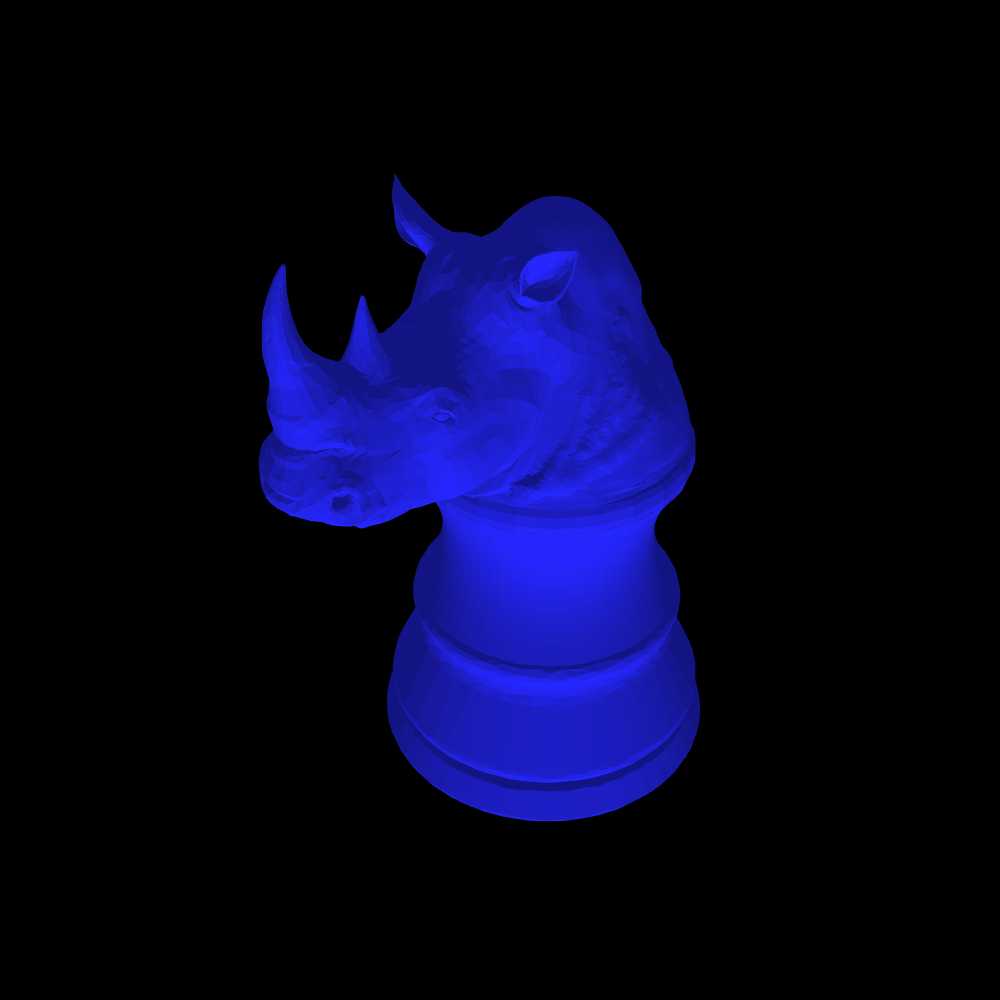
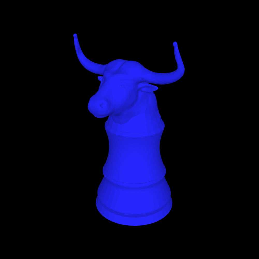
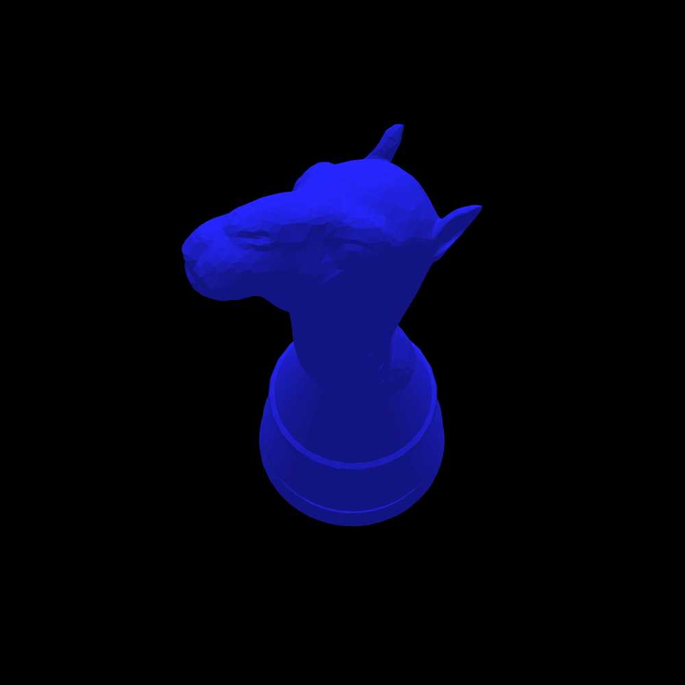
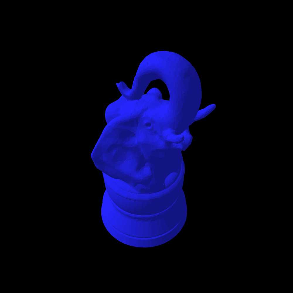
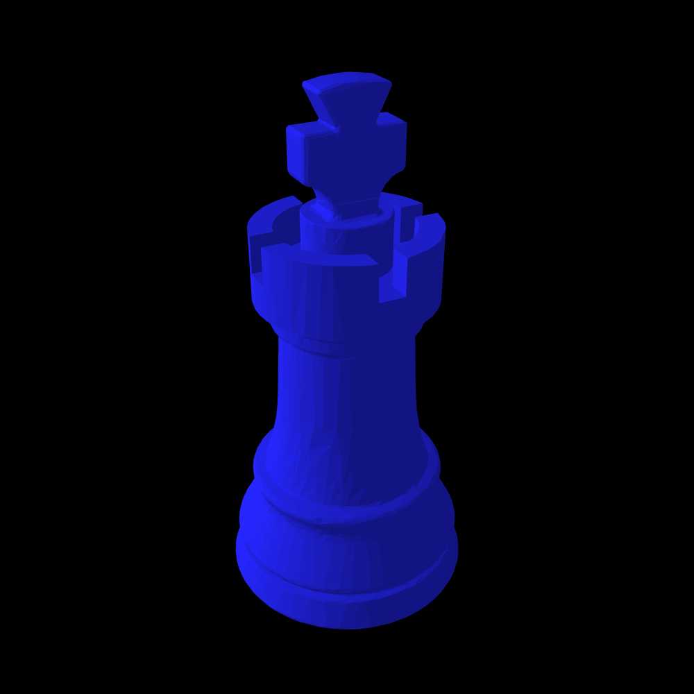
I'm thinking of making a logo specifically for the Darker color scheme using piece designs for 3D printers. However, I want to use images without a background behind them, and I think it would be appropriate to include a Nightrider, though it doesn't look like anyone has made one. Since Bob Greenwade and Jean-Louis Cazaux are the most active in making such pieces, one piece from each might be appropriate. What ideas do you guys have?
I do have a Nightrider, though given a choice my favorite piece that I've designed has been a Bodyguard.
I'll link the Thingiverse images of both tomorrow morning, and probably make neutral-background images as well.
@ Fergus: I can make an image of any 3D piece without any background. Just tell me which one from here if you want to make a test:
https://www.chessvariants.com/craft/a-catalog-of-3d-printable-chess-variant-pieces
Of course, that can be done with Bob's pieces as well.
Maybe Archbishop and (sorry but I just suggest) my Zip or (better) Torch?
Both these my pieces have 3D models made by Bob.
My Nightrider and Bodyguard, as promised:
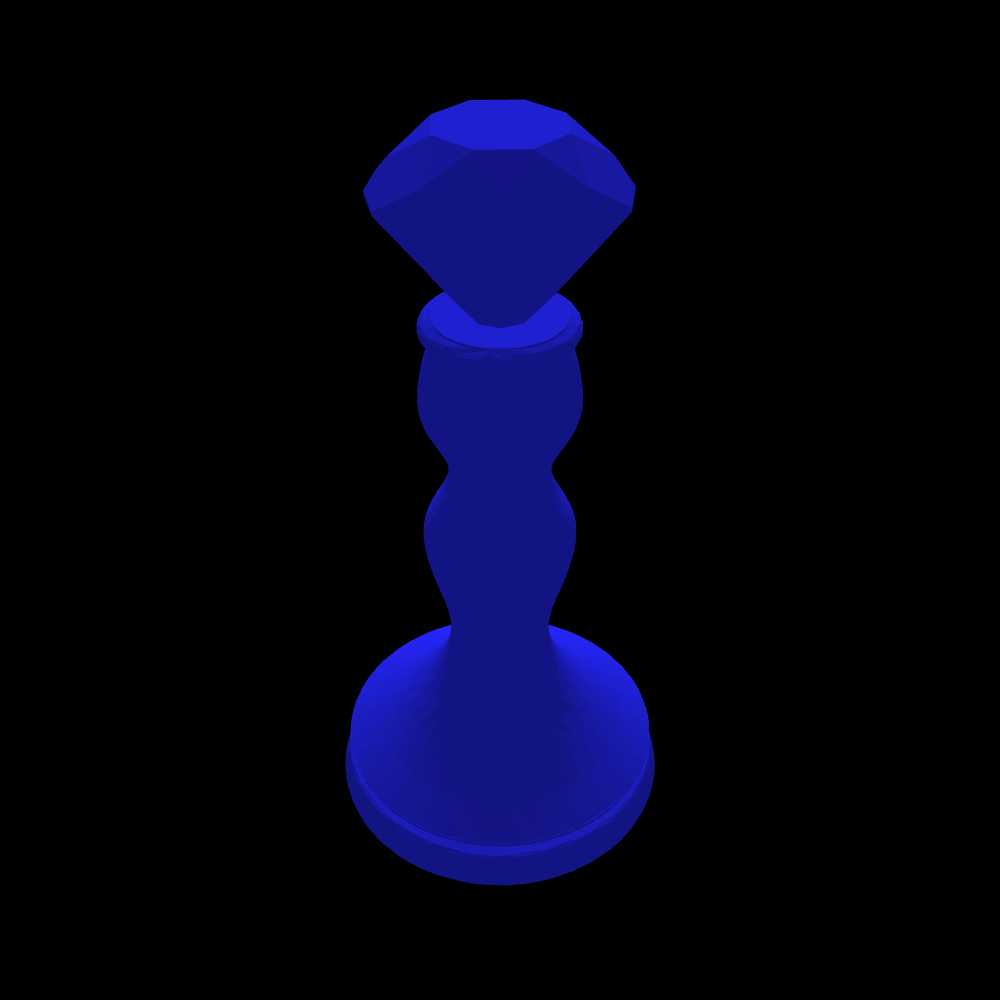
Since Lev mentioned them, the Zip and Torch:
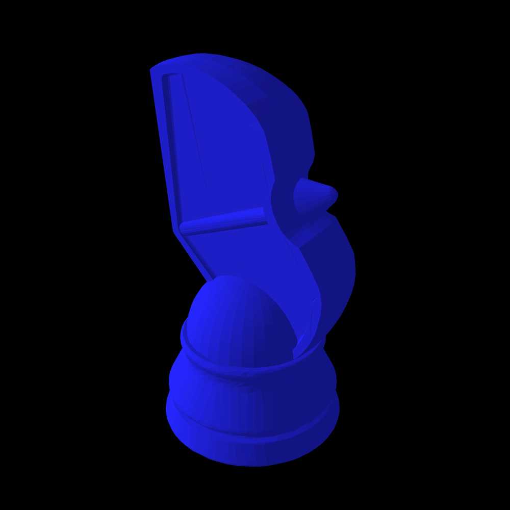
And, just for giggles, my Grandmaster Mage and Anvil:

I can set about making the neutral-background pieces just about any color you want, if there's a preference. I'll assume want just the first two unless you say otherwise (though I may do them all just for the heck of it).
The main reasons I'm interested in a Nightrider are that (1) it fits a nocturnal theme, (2) it resembles a regular Chess piece enough that someone could recognize it as a Chess variant piece if they saw it out of context, and (3) it is one of the better known fairy chess pieces. Some other pieces of yours that might work for the first two reasons are Midnighter, Moonrider, Thaumaturge, and Luna Pawn. So I would be interested in seeing these with a neutral background too.
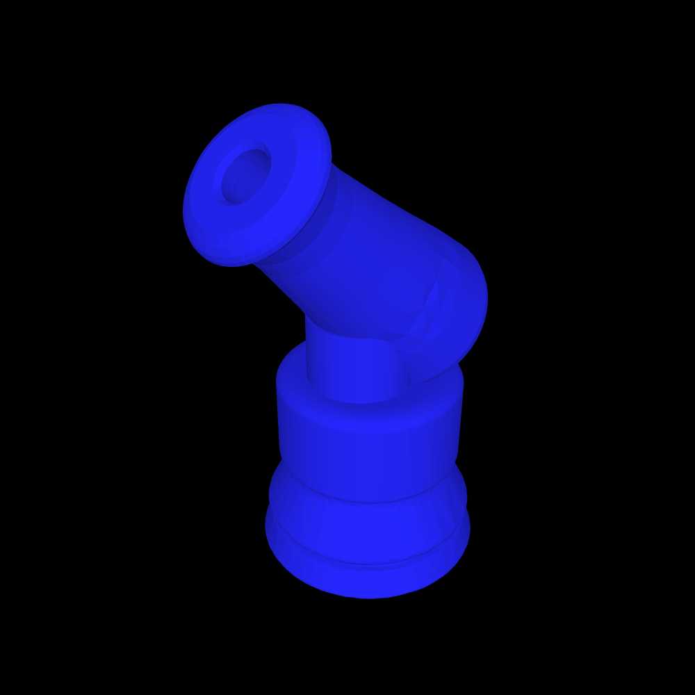
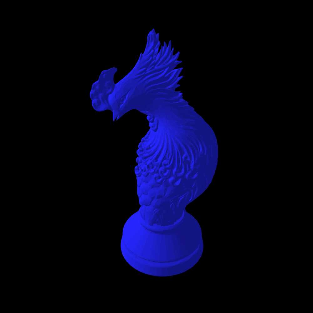
Let's try the cannon, the chancellor, the dragon king, and the phoenix.
I wasn't sure what you'd want/be able to use as far as piece and background colors, so I just played with it a little. I can change them as desired.
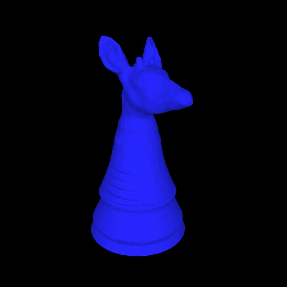
Here's the Midnighter and Thaumaturge, for starters.


And I still do like my Phoenix.

I'll get the others you asked about later in the day, once I know your color preferences (other than being careful with reds).
This is for the Darker color scheme, which has a black background. Blue will be fine, since it shows up well against black, and it contrasts with another piece being white. The tallest piece in the Dark scheme's logo is 427, and the height of the logo is 432. Without the pieces, the text part of the logo has a height of 415. If I do like I did with the Light logo, a piece height of 285 would work.
I'm trying to change the visibility of this page to members-only from private, but it says "you are limited to submitting nine of your games for review and publication at a time" and fails even though I only see that I have two submissions for review. Is the submissions for review page not showing everything?
I think I fixed the conditional. So try it again.
That worked
This is for the Darker color scheme, which has a black background. Blue will be fine, since it shows up well against black, and it contrasts with another piece being white.
So, should I use #0000FF or another shade of blue?
I was thinking, in keeping with the row of figures across the bottom of the Light-themed logo, to make the pieces different colors (nothing outrageous; mainly ivory, tan, grey, muted red, that sort of thing that you might see in an actual chess set).
I figure to leave any resizing and cropping to your (probably more capable) hands.
I agree with your 2) and 3), especially 3). Unfortunately I never made any Nightrider so far. This because I don't like leaper-runners which are difficult to predict on board. But I might do one, one day, as well as the Grasshopper.
I would add another criteria: the 3D piece which is represented should be realistically 3D-printable and not too fragile.
@Bob: which viewer or software do you use to get those images? Blender? or something else, maybe more friendly?
I'm opening the STL files in Paint 3D. Using the 3D view, make the canvas visible and expand it to 8000x6000, and it can be any color desired with the paintcan "fill" function (as can the piece itself).
So, should I use #0000FF or another shade of blue?
Whatever you have been using is fine, or you could use the same color as the Alfaerie pieces use, which is #5984BD.
I was thinking, in keeping with the row of figures across the bottom of the Light-themed logo, to make the pieces different colors (nothing outrageous; mainly ivory, tan, grey, muted red, that sort of thing that you might see in an actual chess set).
While the Darker scheme can be used on monitors, tablets, and phones, I designed it mainly for monochrome eink displays, and my Likebook Mars eink device renders red as black. So colors with mostly red will not work out well on that or similar devices. Since blue is used for the Alfaerie pieces and shows up well on my Likebook Mars, I figured it would be a good choice.
I figure to leave any resizing and cropping to your (probably more capable) hands.
I suppose if I resize it against a black background, it will look fine.
OK, well, here's my shot at a Nightrider image. If this works for you, I'll get to others tonight and/or tomorrow.

I would add another criteria: the 3D piece which is represented should be realistically 3D-printable and not too fragile.
I would presume that anyone who makes 3D pieces is already keeping that one in mind. Since I don't have a 3D printer to test pieces with myself, I will leave it up to you and Bob to judge whether your pieces fit this criterion.
I meant a blue piece on a black background.
Mostly Jean-Louis, since mine's (still) broken.
I meant a blue piece on a black background.
Ah, OK. I'll do that with all of the pieces you asked for (plus a couple others) this evening. (Right now it's time for me to log off for a while.)
Here are the requested pieces (some are overwritten from before, so you may need to flush the cache):


I'd suggest using only one Knight variant and only one moon-topped piece in the lineup; offhand I'd choose the Midnighter and Thaumaturge.
And a few others, sorted roughly in order of importance to include (as I see things, anyway):


Hold off on that Midnighter; I need to update it with better wings.
@ Fergus: I have made images of some of my 3D pieces in blue on black background. I wished to upload the images but I lack space to do it. So I wanted to create a fake page named "Cazaux Vault" to get some room where to upload but I get this message:
"As a veteran contributor with nine or more submissions published so far, you are limited to submitting nine of your games for review and publication at a time. If you would like to post more, cooperate with the editors to get your submissions accepted, or revert something to a work-in-progress and submit something else."
What is this? I don't have 9 games in waiting!?
Does that mean I cannot create any new page?
Here the images you asked Fergus. The blue might be too saturated.


@Bob: I have used this on-line viewer which is working very nice. I recommend, you can easily change the background, the color of the piece, the size of the snapshot, etc.
I wasn’t expecting either of you to change the color of your pieces. I envision the logo as having a white piece supplied by you and a blue piece supplied by Bob.
Additionally, I just looked at these pieces on my Likebook Mars, and they fade into the background too much on it.
I also face this problem and cannot submit new pages…)
I was comparing these on both my iPad and my Likebook Mars ereader, and on the latter, they all appear as grey on a black background. From the Thaumaturge on down, there are sharp contrasts between different shades of grey that look kind of random and ugly. I’m not sure if the horse shape of the first few pieces just leads to a more pleasing shading or if you did something different in the pieces following them, though I suspect it is the shape that makes the difference.
@ Fergus: well, it's a bit your fault Fergus. You asked both Bob and me and then it was not possible to understand that you were not speaking to both of us. About the color, I first understood that you wanted pieces on a blue background, so did Bob, then that you wanted blue pieces on a black background. If you prefer white pieces on a black background it is not a problem at all.
Actually, there is something VERY simple to do, a piece of cake for you. You go to:
https://www.thingiverse.com/kazo65/designs
There you can download the .stl of the piece you would like.
Then you open that .stl with:
And you can have a snapshot of that piece with the color you like, the background you like, the orientation you like, the size you like, etc.
If you can't do that and need help, please tell me exactly which piece/color/background you would like, I will make it for you.
I think you're right about the shapes making the difference. I think I'll try them in a medium brown (I'd go for tan, but apparently I'm the Black player), and maybe add a couple of angular pieces.
"I just looked at these pieces on my Likebook Mars, and they fade into the background too much on it."
I don't have a Likebook Mars, so I don't know what you mean.
I just uploaded wood-brown versions of everything, plus four new pieces.


Hopefully, brown works at least a little better.
I don't have a Likebook Mars, so I don't know what you mean.
It is an Android tablet with an eink display intended primarily for reading. The important thing you need to know is that it displays everything in black and white eink, which has even fewer gradations of grey than a grey monochrome image on an LCD monitor would have. Since I made the Darker color scheme for use with it, I am testing how the images intended for this color scheme look on it.
Also. Anybody hears us?!
I was just thinking that it might be time to take a break and let Fergus address the issue you and (IIRC) David are having.
Hopefully, brown works at least a little better.
It doesn't. The coloring is very splotchy, though more so on curved surfaces than on flat surfaces, as can be seen in this color image of a color scan of my Likebook Mars:

Yeah, it's the curves all right -- specifically, curves that are both horizontal and vertical.
There's not much to be done about that, unfortunately, mostly because I don't have many pieces (almost none, in fact) that don't have that feature. Either you'll have to use just the Nightrider, or Lifebook Mars users will just have to deal.
I can try to find some pieces of that sort, like the Vivi and Double Cross, but there aren't going to be many.
That said, I really like the brown ones in full-color mode.
I think I can work with the 3dviewer.net website, but I don't have a link to Bob's thingiverse account. Considering how many 3D pieces he designs, it would be a good idea for him to include a link to it in his profile.
100 comments displayed
Permalink to the exact comments currently displayed.
Hi Fergus
The About the Author and Introduction links gave me no problem. However, the Early Attempts at Deriving These Values link caused a White page, i.e. crash.