🕸Fergus Duniho wrote on Tue, Sep 1, 2015 08:17 PM UTC:
I fixed the Shogi page to fit on a phone. I did a few things. The one I did globally was to add this code to the header file:
IMG {max-width: 100%;}
This will make banner ads and other large images fit the screen without making the text too small.
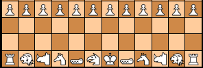
On the Shogi page itself, I reduced the pieces table to two columns by putting piece images and the description into a single column. I also put the two diagrams into a diagram class, which is defined like so:
I have checked the page with Android's default Browser, Boat Browser, Chrome, Dolphin, Firefox, and Opera, and it works fine in all of them with minor glitches in some. In a few, the diagrams get stretched vertically, though this is actually appropriate for Shogi. And in a few, the sidebar appears above the rest of the text instead of beside it.
I fixed the Shogi page to fit on a phone. I did a few things. The one I did globally was to add this code to the header file:
IMG {max-width: 100%;}This will make banner ads and other large images fit the screen without making the text too small.
On the Shogi page itself, I reduced the pieces table to two columns by putting piece images and the description into a single column. I also put the two diagrams into a diagram class, which is defined like so:
@media screen and (max-width: 480px) {
IMG.diagram {width: 100%; height: 100%;}
}
And I put the diagrams in DIV.left and DIV.right containers, defined like so:
@media all and (min-width: 1110px) {
DIV.left {width:40%; float: left; margin: 5%}
DIV.right {width: 40%; float: right; margin: 5%}
}

@media all and (max-width: 1109px) {
DIV.left {width: 100%; clear: both; float: none; margin: auto;}
DIV.right {width: 100%; clear: both; float: none; margin: auto;}
}
I have checked the page with Android's default Browser, Boat Browser, Chrome, Dolphin, Firefox, and Opera, and it works fine in all of them with minor glitches in some. In a few, the diagrams get stretched vertically, though this is actually appropriate for Shogi. And in a few, the sidebar appears above the rest of the text instead of beside it.