I have begun to maintain a fork of betzaNew.js at /fergus/betzaFlex.js. Since it differs from betzaNew.js in various respects, I am just providing it as an alternative. Although I have mentioned some of its differences on other pages while working on it, I will summarize them together here:
It uses flexbox to make the content that normally shows up below the board to show up alongside it to its right when the viewport is wide enough. This involves grouping its output with some extra divs to which some flex CSS is applied.
To keep the display from jumping back and forth between a one column display and a two column display at certain widths, it changes how it hides and unhides sections of output. Instead of changing the value of display between none and inherit, it changes the value of visibility between hidden and visible, and it changes the value of height between 0px and auto. The effect of doing this is that the second column is always as wide as its widest element even when that element is invisible.
Instead of assigning fixed sizes to the table cells in the diagram, it uses the CSS min function to calculate a size that will best fit the screen on small mobile devices. The min function is given three values. Besides the assigned value, these are the maximum height (in vh units) and the maximum width (in vw units) any cell can have for the whole board to fit the display. Since these values will be greater on large screens, it will use the assigned value when there is enough space. But when the screen isn't large enough to fit the whole board at the assigned size, it will calculate and use a smaller size that will fit the screen.
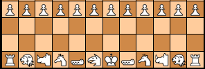
So that each space on the board will maintain a 1 / 1 aspect ratio and display at the proper size, it assigns both a height and a width to every single table cell in the diagram. As described above, this is a flexible height and width that will adjust to fit the whole board on small screens.
Instead of displaying the border when rimColor is not #FFFFFF, it displays it when it is not #FFFFF0, as that is the actual background color for pages on this site.
I have begun to maintain a fork of betzaNew.js at /fergus/betzaFlex.js. Since it differs from betzaNew.js in various respects, I am just providing it as an alternative. Although I have mentioned some of its differences on other pages while working on it, I will summarize them together here:
displaybetweennoneandinherit, it changes the value ofvisibilitybetweenhiddenandvisible, and it changes the value ofheightbetween0pxandauto. The effect of doing this is that the second column is always as wide as its widest element even when that element is invisible.minfunction to calculate a size that will best fit the screen on small mobile devices. Theminfunction is given three values. Besides the assigned value, these are the maximum height (invhunits) and the maximum width (invwunits) any cell can have for the whole board to fit the display. Since these values will be greater on large screens, it will use the assigned value when there is enough space. But when the screen isn't large enough to fit the whole board at the assigned size, it will calculate and use a smaller size that will fit the screen.