Comments/Ratings for a Single Item
I initially resisted using Georgia, because it is a system font. But it is a really good font, and I decided to place it at the beginning of the list of fonts. I also grew tired of Catamaran and placed the even more neutral Segoe UI in front of it, this being the font I already use for the menu. I dropped the font-size from 20 to 18, because fonts other than than EB Garamond seemed too large at that size.
 H. G. Muller wrote on Wed, Oct 4, 2017 07:31 AM UTC:
I dropped the font-size from 20 to 18, because fonts other than than EB Garamond seemed too large at that size.
This is indeed much better.
It can be hard to find just the right font. Tinos was beating other fonts in legibility, but it was also plainer looking than the competition. One thing I noticed about it was that it seemed to have more space between lines. So I slightly increased the line-height with fonts that looked prettier and got improved legibility. I tried various fonts, often finding something or other wrong with them. PT Serif was looking good for a while, but it had an ugly capital Q. Cormorant Garamond had a Q with a long tail that reached under the next letter. That might look fine when it is always paired with a u, but it doesn't work for the letter Q by itself as an abbreviation for Queen. Crimson Text had faint quotation marks. There are more I could test, but for now, Spectral looks like a good choice. It seems to have a good balance between legibility and prettiness without having any weird looking letters or different sized numbers.
H. G. Muller wrote on Wed, Oct 4, 2017 03:16 PM UTC:What's this?
I do have a 900px wide table on that page (500 + 400-wide cells), but that shouldn't force the width of the text so large as it is here, on my 1366px-wide screen. And that table is hidden.
I don't know why that would happen. I have been trying out different fonts today, but that shouldn't cause that to happen.
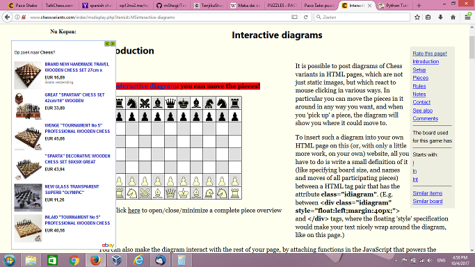
Curiously, the Donate button on the interactive-diagrams page is much bigger than on other pages, which suggests there is something different about the CSS on that page. I also got some overlap between the ad and the page content when I sized that page's window small enough, but I can't duplicate this for other pages. So, you should check whether you are doing anything to the CSS on this page that would cause this overlap.
H. G. Muller wrote on Wed, Oct 4, 2017 03:40 PM UTC:Well, it was still OK a few days ago, and I did not change the text for quite some time, when went through the page to upload new graphics. So it must be something in the global settings or the display script, controlled by you. This is another indication that it cannot be due to the width of the hidden tables; they weren't too wide before.
The final step of the Design Wizard (after pressing 'Show HTML') now also has become a disaster: the box showing the HTML (a 1x1 table) is now so wide that it completely crushes the diagram on the left.
In case it helps, the window width at which I got the overlap is 1352px, and the viewport width is 1338px. The left ad normally displays in the width range of 1331px to 1535px. The narrow right ad displays in the range of 1240px to 1330px. Below a width of 1240px, the sidebar ads do not display at all.
It seems that the font I was currently trying out arranged your text in a way that caused the article width to be wider than the value max-width had been set to. So I just moved on to trying a different font.
Here are characteristics I want in a body font:
- Each character is self-contained in its own box. For example, the tail of the Q should not extend underneath other characters.
- The line in the e should be horizontal. So, garalde old style is preferable to humanist old style.
- The letters l and h should not be especially taller than capital letters. Words like All and The shouldn't have capitals letters significantly shorter than the letters that follow them.
- Letters should not have thick vertical lines and thin horizontal lines like modern or didone fonts do. So, old style and transitional fonts are to be preferred.
- Letters should not be too fancy or too plain.
- Letters should be easily legible, and reading lines of text should proceed quickly.
- Letters should not be too heavy or too light.
- Numerals should be the same height as each other.
- It should ideally include multiple styles and weights.
- Letters should not be too wide or fat.
- Apart from acenders, lowercase letters should be the same height. The letters d and b should not have lower parts that are taller than an e. The letter c should not be taller than r.
I have been trying out different fonts, but I'm taking a break now. The current body font is Tienne by Vernon Adams.
H. G. Muller wrote on Wed, Oct 4, 2017 04:49 PM UTC:Add:
Digits should be taller than letters, so that things like "12x10 board" aren't difficult to read.
The current font fails in this respect. It even has some digits (such as 5) stick out beneath the baseline.
BTW, the overlapping ad seems to be cause by long lines in a <pre> element forcing the text to be wide enough to contain them. And they got longer because of your larger fonts.
The screen is of course wide enough to contain these lines, but it insists to waste a few hundred pixels on a wide left margin, because some 5 screen sizes above it there is this annoying ad, using the upper 5% of the ASIDE side bar. And on screens smaller than 1331px, the side bar is gone, but the (vertically oriented) ad is displayed in a (horizontal) header, forcing you to first scroll down two screens before you can see any of the true content of the page.
I don't understand why you bother with typography while the overall layout of this website still so utterly sucks...
Add:
Digits should be taller than letters, so that things like "12x10 board" aren't difficult to read.
Yes, that seems important.
I don't understand why you bother with typography while the overall layout of this website still so utterly sucks...
You have to avoid hyperbole and remember that your perspective is not mine. If you are dissatisfied with something, you should provide a detailed bug report, not vent your emotions.
The current font is one called Average. The Q's tail goes underneath the next letter a little bit, but it is not too bad. This has only one style. So italics is just slanted. Here is some boldface. It otherwise seems to fit my criteria.
Average and Malabar look so much like each other, I couldn't tell that the font was changing when I resized the window. I had to meticulously compare their characters, find some that were different, then enlarge the text enough to make comparisons. When comparing them at the same size, I can see that Malabar is bigger and darker, which makes it good for the body font on mobile devices, but not so good for it on desktop monitors. Since Malabar has been my main font for reading books on my Kindle, its resemblance to the lighter, smaller Average is a good reason to stick with Average on the desktop. [Note: Unless you have Malabar installed, you will see Volkov when you shrink the window.]
H. G. Muller wrote on Wed, Oct 4, 2017 07:36 PM UTC:If you are dissatisfied with something, you should provide a detailed bug report, not vent your emotions.
Well I thought I did. Let me try it with a (window) screenshot then:
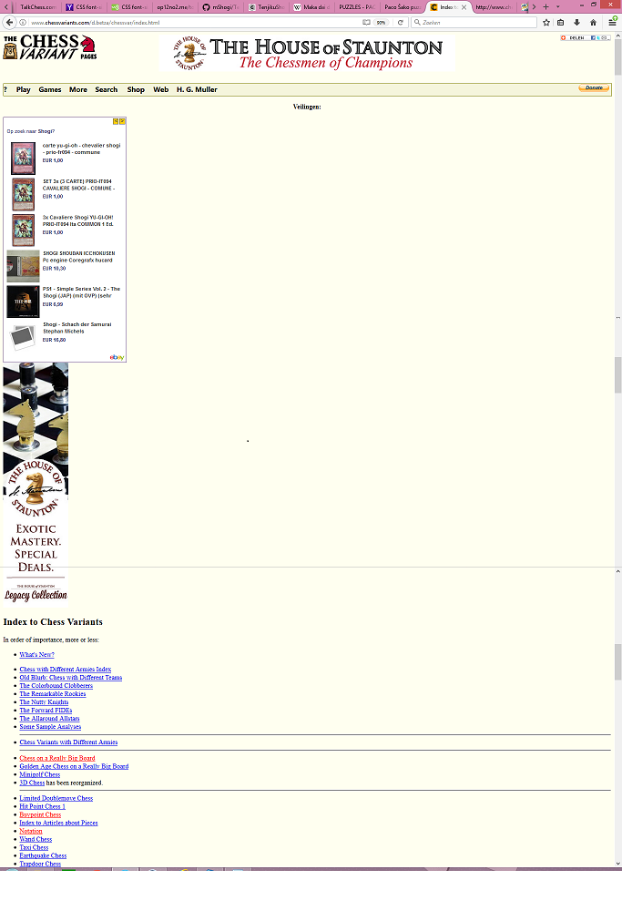
When the viewport is too narrow for the left side bar (as on my Linux VM), the first two screenheights of every page have no content, just ~70% blank space and ~30% ads, and you have to scroll down two screens to even see what the page is about. Because an ad is placed in an area with a completely wrong aspect ratio for it. I do't see why we would need an extra ad above the article content: there already is one above the menu bar (fortunately of a more suitable shape).
Apart from this being very annoying when you switch between pages, it also creates a large distance between the menu bar and the place where you have scrolled to when you want to use it. I think it is pretty ridiculous that there is anything between the menu bar and other content. The whole idea of having a menu bar is that it should be in easy reach. So if displaying adds has so much priority over displaying content that multiple screenheights of advertizement are a necessity, the menu bar should at least be below it, near the actual content.
H. G. Muller wrote on Wed, Oct 4, 2017 08:42 PM UTC:This is also very sloppy:
Why does the header ad jump to below the logo at this total width. There seems to be plenty of room to display it. And if not, it should shrink rather than jump.

I cannot replicate this, but this is what I would expect to happen if the globalindex.css file wasn't loaded and working. Have you done anything to disable or interfere with this site's CSS? If not, I need precise details on the conditions under which you find this happening.
The top banner shares the space with the logo and the share widget, and it will jump down if squeezed out. For what's happening in the other picture, I will need precise details on the conditions under which it is happening. This includes the browser, the OS, the screen width, the window width, the viewport width, and anything going on that could be affecting the CSS.
H. G. Muller wrote on Thu, Oct 5, 2017 08:21 AM UTC:The top banner shares the space with the logo and the share widget, and it will jump down if squeezed out.
Well, that sucks. Page banners are not supposed to do that. Especially since in the shown case the banner is not 'squeezed out' at all: there is plenty of space to display it. The technical reason for it to happen just shows the poor design. If you want the layout of the header to change under width-pressure, it would make more sense to move the share widget to under the logo, as the banner is usually higher than logo and share widget together. Using floating style is just the wrong techology for formatting page headers. The elements should be forced to stay side by side, and in extreme cases shrink to fit or summon a horizontal scroll bar.
For what's happening in the other picture, I will need precise details on the conditions under which it is happening. This includes the browser, the OS, the screen width, the window width, the viewport width, and anything going on that could be affecting the CSS.
Well, I don't mess with the CSS, and it is very surprising you cannot reproduce this effect.It is not like I have to go looking for these things; they jump you all the time when using this website. The "ad below menu bar" happens on every page except some submission forms (which have no ads, header and menu bar at all), whenever I narrow the viewport to the point where the left side bar closes. It doesn't seem dependent on the OS or browser used, (the screenshot was taken with FireFox 10.0.1 on Ubuntu Linux, and the viewport size should follow from the image width, which is demagnified by a factor 2), and is likely caused by faulty or missing style definitions for the side bars in the various width ranges where they occur.
The relevant part of the 'Page Source' causing the "large white space" screenshot is below, and the page looks just like what you would expect if there isn't a special style definition for the rightcol or leftcol ASIDE; it would just display it above the ARTICLE, as that is where it appears in the source:
<DIV CLASS="middle">
<ASIDE CLASS="leftcol">
<script type="text/javascript"><!--
amazon_ad_tag="chessvariants-20";
amazon_ad_width="300";
amazon_ad_height="250";
amazon_color_background="EBECDF";
amazon_color_border="AFA938";
amazon_color_logo="504706";
amazon_color_link="2B5A6B";
amazon_ad_logo="hide";
amazon_ad_title="The Chess Variant Pages Gift Shop"; //--></script>
<script type="text/javascript" src="http://ir-na.amazon-adsystem.com/s/asw.js"></script><script language='JavaScript1.1'>
document.write("<sc"+"ript language='JavaScript1.1' src='http://rover.ebay.com/ar/1/711-53200-19255-217/1?campid=5337821335&toolid=7115320019255217&customid=&mpt=" + Math.floor(Math.random()*999999999999) + "&adtype=3&size=300x250&mpvc='></sc"+"ript>");
</script>
<noscript>
<a href='http://rover.ebay.com/rover/1/711-53200-19255-217/1?campid=5337821335&toolid=7115320019255217&customid=&mpvc='>
<img border='0px' src='http://rover.ebay.com/ar/1/711-53200-19255-217/1?campid=5337821335&toolid=7115320019255217&customid=&mpt=[CACHEBUSTER]&adtype=1&size=300x250&mpvc=' alt='Click Here'>
</a>
</noscript><SCRIPT>
if (window.canShowAds === undefined) {
document.write(`<FIGURE>
<FIGCAPTION>Musketeer Chess Fortress and Unicorn Kit Bundled with HOS Luxury Plastic Chess Pieces</FIGCAPTION>
<A HREF="http://www.houseofstaunton.com/unicorn-and-fortress-chess-kit-with-black-natural-plastic-pieces.html?___store=houseofstaunton_en&acc=eb163727917cbba1eea208541a643e74"><IMG SRC="http://www.houseofstaunton.com/media/catalog/product/cache/3/small_image/267x240/9df78eab33525d08d6e5fb8d27136e95/m/a/marshall-overlay_4.jpg" ALT="Musketeer Chess Fortress and Unicorn Kit Bundled with HOS Luxury Plastic Chess Pieces" TITLE="Musketeer Chess Fortress and Unicorn Kit Bundled with HOS Luxury Plastic Chess Pieces"></A>
</FIGURE>
<FIGURE>
<FIGCAPTION>Musketeer Chess Dragon and Spider Kit Bundled with HOS Luxury Plastic Chess Pieces</FIGCAPTION>
<A HREF="http://www.houseofstaunton.com/spider-dragon-chess-kit-with-black-natural-plastic-pieces.html?___store=houseofstaunton_en&acc=eb163727917cbba1eea208541a643e74"><IMG SRC="http://www.houseofstaunton.com/media/catalog/product/cache/3/small_image/267x240/9df78eab33525d08d6e5fb8d27136e95/m/a/marshall-overlay.jpg" ALT="Musketeer Chess Dragon and Spider Kit Bundled with HOS Luxury Plastic Chess Pieces" TITLE="Musketeer Chess Dragon and Spider Kit Bundled with HOS Luxury Plastic Chess Pieces"></A>
</FIGURE>
`);
}
</SCRIPT>
</ASIDE>
<ASIDE CLASS="rightcol">
<iframe src="//rcm-na.amazon-adsystem.com/e/cm?o=1&p=14&l=ur1&category=topgiftideas&banner=1PS7NTZH9Z597A9KKWR2&f=ifr&linkID=dba816b2b2d0685889719280db7301d6&t=chessvariants-20&tracking_id=chessvariants-20" width="160" height="600" scrolling="no" border="0" marginwidth="0" style="border:none;" frameborder="0"></iframe></ASIDE>
<MAIN>
<ARTICLE>
H. G. Muller wrote on Thu, Oct 5, 2017 12:39 PM UTC:Here is another (rather extreme) example. This time from FireFox 55.0.3 (32-bit) on Windows 8.0, with a 1366px-wide screen (maximized window). I glued 3 screenshots taken at different scrolls together:
It seems like two ads, partially covering each other, are inserted between the menu bar and the article text. Likely the upper one is the "leftcol" ASIDE, and the lower, narrower one the "rightcol" ASIDE.
The page http://www.chessvariants.com/d.betza/chessvar/index.html had an incorrect link to the style sheet. This page was two directories deep, but the link went back only one directory. This is now fixed.
It appears that the comments page currently has some content on it that prevents the main section from growing narrower. I don't know if there is a way to test for this in CSS.
H. G. Muller wrote on Thu, Oct 5, 2017 03:59 PM UTC:The page http://www.chessvariants.com/d.betza/chessvar/index.html had an incorrect link to the style sheet. This page was two directories deep, but the link went back only one directory. This is now fixed.
I was wondering about this, because seeing two ads was a-typical. I still see one ad, though, in the submission form I am now typing in...
The problem with linking can be prevented by avoiding relative path names in intra-site links. Nowadays I always use "/membergraphics/MSinteractive-diagrams/betza.js" for the link to the JavaScript in interactive diagrams, because the "../membergraphics/..." did not work for some subjects deeper in the tree (I think it was Centennial or Omega Chess). And when you view them in isolation you are one level from the root.
BTW, I noted that page sources tend to be very bloated. There is always an enormous amount of JavaScript related to the menus, which furthermore is full of intra-site links that also has the server URL in it. If you ever want to reduce the bandwidth this site consumes (by a factor 10 or so), this would be a good place to start.
It appears that the comments page currently has some content on it that prevents the main section from growing narrower. I don't know if there is a way to test for this in CSS.
What can that be? The screenshots I posted are not that wide, this is why I demagnified them. The page source I posted as normal text, so that is can be wrapped over lines at any space. For me the text width just adapts when I narrow the window, until I try to shrink it below the width of the screenshots. Then a horizontal scroll bar appears.
25 comments displayed
Permalink to the exact comments currently displayed.
I found out last night that the browser on my Kindle Touch can use the fonts I have put on my Kindle for reading books. With that in mind, I began the list of fonts for widths of 1239 and below with Malabar, which is the main font I use to read books on my Kindle. This font is actually found on the Nook, a rival ereader from Barnes & Noble, but since I have both, I copied the Nook's fonts to my Kindle. I did not include Malabar in the list for larger screens, because it seems too dark and heavy for the big LCD screen.
I also broke the 1 to 1239 range into two ranges: 1 to 599 and 600 to 1239, so that I could use a larger font on my Kindle than is needed on my phone. I will eventually turn to checking out the typography on tablets.
I also added CSS to make the <Q></Q> tags use curly quotes. You can use these for quotations in prose that is meant to be read by people. Straight quotation marks should be reserved for computer code.