Comments/Ratings for a Single Item
It doesn't matter too much as I write descriptions within the page anyway
The link description gives someone a reason to visit your page, and a description on the page itself would not serve this purpose.
 H. G. Muller wrote on Fri, Oct 6, 2017 07:33 AM UTC:
I have no idea what improper design you have in mind. The code you mentioned serves a purpose, and getting rid of it would be gutting functionality.
Well, I wasn't suggesting you were just using that code as a filler to drive up hosting costs. But if the code to serve that purpose is nearly the same for nearly every page, the proper design would be to locate it in a separate file, and just put a link to that file in all those pages. Then the code would need to be loaded only once for every user visiting the site, and all pages he would access for a long time to come would use the version cached in his browser.
What do you think requires more functionality on this page, the menu bar, or the interactive diagram for Golden Age Chess? Now take a look at the page source. The diagram makes up about 25 short lines of that, the menu bar about 500 sometimes excessively long lines (line 11-59 for in-page style definitions, and line 80-513 for the HTML and JavaScript). The HTML source of all pages here seems about 10 times as long as one can reasonably expect from their content.
The banner is centered on the screen, and as soon as there isn't room for it to remain centered on the screen between the logo and the share widget, it drops down lower.
Indeed. This is a bit like explaining to a person whose house you just set on fire how chemical reactions with oxygen work, so that what he is seeing is a quite natural phenomenon, and nothing to worry about.The point is of course that it is wrong to require that the banner is centered when there is obviously not enough room to center it in-line with the logo. What is so important about centering that banner that justifies it taking extra vertical space pushing content off screen? Who would die if it was right-justified instead?
No website I have ever seen does this with its header. Have you conducted a poll under users, and did the majority all say "Wow, this is really how a page header should look! Amazing no one else ever invented such a beautiful layout!" when you presented them with the header screenshot I posted? I would be surprised if you could find anyone who didn't think it sucks big time. Worrying about how much a descender of a capital Q protrudes under these conditions seems a very strange priority.
to Fergus
Is it simple and straightforward to use the link description
I don't kow how to use it - perhaps someone could tell me
But if the code to serve that purpose is nearly the same for nearly every page, the proper design would be to locate it in a separate file, and just put a link to that file in all those pages.
That's a good idea. Stick to offering contructive solutions, and you will be good.
What do you think requires more functionality on this page, the menu bar, or the interactive diagram for Golden Age Chess? Now take a look at the page source. The diagram makes up about 25 short lines of that, the menu bar about 500 sometimes excessively long lines (line 11-59 for in-page style definitions, and line 80-513 for the HTML and JavaScript).
To be precise, code should be measured in bytes, not lines. My JavaScript for the menu takes up 7474 bytes, while your betza.js file takes up 57,438 bytes. Your comment with the Golden Age Chess diagram adds 1237 bytes.
The HTML source of all pages here seems about 10 times as long as one can reasonably expect from their content.
That doesn't seem to be based on accurate measurement, and it is probably incorrect.
Indeed. This is a bit like explaining to a person whose house you just set on fire how chemical reactions with oxygen work, so that what he is seeing is a quite natural phenomenon, and nothing to worry about.
That is a completely disingenuous analogy. I was explaining why there was no more room for the banner ad when there appeared to be more room for it.
The point is of course that it is wrong to require that the banner is centered when there is obviously not enough room to center it in-line with the logo.
That is a matter of personal preference, not of morality. Do not imagine that every personal preference of yours carries the weight of morality.
What is so important about centering that banner that justifies it taking extra vertical space pushing content off screen? Who would die if it was right-justified instead?
Who would die if you had to scroll the screen? Do you know how ridiculous you sound?
No website I have ever seen does this with its header.
So what? Argumentum ad populum doesn't work with me.
H. G. Muller wrote on Fri, Oct 6, 2017 02:56 PM UTC:To be precise, code should be measured in bytes, not lines. My JavaScript for the menu takes up 7474 bytes, while your betza.js file takes up 57,438 bytes. Your comment with the Golden Age Chess diagram adds 1237 bytes.
But the point is that it is almost never loaded, because when you have seen one diagram, you have seen them all: the browser caches the file, and keeps it around for a long time, probably forever as long as you regularly view diagrams (or until you decide to flush the browser cache for the page). If someone views 10 pages and has to load the menu script in each page, you are already up to 74,740 bytes. Load 20 pages per day for a week and you are at a megabyte.
The HTML description of the menus is also quite large, and could probably easily be generated by a JavaScript program (residing in a separate file shared by all pages). Or, when you don't want to rely on JavaScript, by including it from a separate URL through an <object> tag.
That is a completely disingenuous analogy. I was explaining why there was no more room for the banner ad when there appeared to be more room for it.
The analogy is about how this misses the point. The question is not about the cause, but about the reason. Why do you want to waste space on the page when there is no compelling need for it?
That is a matter of personal preference, not of morality. Do not imagine that every personal preference of yours carries the weight of morality.
That is just nitpicking over whether the use of the word 'wrong' is correct, against a non-native English speaker. Of course I do not mean that it is immoral or criminal to do this. Just that it is ugly, and an embarresment for the site.
Who would die if you had to scroll the screen? Do you know how ridiculous you sound?
Well, so what would happen that you want to avoid by forcing the banner in the center, that is so important than it takes priority over wasting vertical space on a page that doesn't fit entirely on the screen?
So what? Argumentum ad populum doesn't work with me.
Well, that seems to be part of the problem, then. Because very often there is a good reason why people do things in a certain way, and not in another. IMO it never hurts looking around to see what 'state-of-the-art' websites look like.
But to not digress from the actual issue: do you want to maintain that this staggered header design is just what you intend, better than any possible alternative and more usual design? If so, it raises questions about the status of this website: should it be considered an expressionist work of art, that people can admire or puke over according to how well their sense of aesthetics agrees with that of the artist, or is it supposed to service the chess-variant community in the best possible way.
Greg Strong wrote on Fri, Oct 6, 2017 04:01 PM UTC:@Fergus: I agree with H. G. that the header droping like that isn't ideal. Finding something better, IMO, would be good.
@H.G.: Wow. You are becoming seriously cantankerous in your old age. I've been reading your posts here and on talkchess for well over a decade and I've never seen you so agressive and adversarial. You seem very upset. I do understand having strong feelings about this site. You have been a very active supporter of chess variants. Between Winboard, Fairy-Max, your other engines, carefully evaluating piece valuations, etc., you have put an incredible amount of time into this area. So it is understandable that you want this site to be as nice as possible. I'm with you. But this conversation is going down-hill. You are now jumping from thing to thing, seemingly looking for things to point out to try to demonstrate that the site is a disaster, in what I would consider, frankly, a mean-spirited way. I'd ask you to dial that back.
I would respectfully suggest: First, letting it rest for a day or two. Then, we start freah, in an email thread with you and the editors, where we can discuss. A public confrontation, which is what this is, is not helpful to anyone. If we need community weigh-in on the subjective merits of anything, we can always start a new thread. This discussion is no longer about typography anyway.
H. G. Muller wrote on Fri, Oct 6, 2017 05:40 PM UTC:Well, I am not really upset (although I think I have every reason to be). What you see is more the result of problems I raise bouncing off from a wall of indifference, so that I have to storm the ivory tower with more force in the (re)retry. And when I make a helpful suggestion for improvement of something I happened notice when going through the page sources in order to assist in diagnosing the real problem, it is suddenly elevated to a issue in itself, rather than embraced, which admittedly throws the discussion off track.
I don't see any disadvatage in a public debate over something that concerns us all. (I mean, why open a thread on 'improving typography' if it is not to sollicit for feedback?). But if you rather conduct it by e-mail, that is fine with me. Is there some sort of mailing list for editors one can mail to, so that they get it all? As far as I am concerned we can start imediately; what I'd have to say in two days wouldn't be any different from what I would say now.
Greg Strong wrote on Fri, Oct 6, 2017 06:26 PM UTC:Public debate is fine if if it is constructive and corgial. As for the belief that 'storming the ivory tower' is going to make people more receptive to your ideas, I can only respectfully disagree.
I know you bring a lot to the table and I value your opinion and I believe Fergus does too. Lets try to take things one at a time and stay positive. I will try to help but I must appologize for my limited utility as I know almost nothing about CSS and absolutely nothing about JavaScript (although obviously it's time I started learning.)
H. G. Muller wrote on Fri, Oct 6, 2017 07:25 PM UTC:Well, when they could not possibly be less receptive, there is nothing to lose. At least it succeeded in attracting your attention.
JavaScript is nothing but a C-like programming language that is loaded from a website and executed by the web browser, and that can generate or alter the HTML on the page it comes with in any way it wants, spontaneously or in response to mouse clicks or key strokes. That is really all you have to know about it, if you don't want to write a program yourself.
This is not a discussion about technical issues anyway. It is about whether the site performs as it should for the majority of non-technical users, and whether we have a policy that sufficiently respects the work of contributors that do not happen to be editor or site maintainer.
I have noticed that the fonts Average and Volkhov are very similar to each other. Average is the font used for large screens, and Volkhov is the font used for small screens, though Malabar may be used in place of Volkhov if you have it installed.The main difference between Volkhov and Average is that Volkhov is darker and heavier, making it more suitable for small screens. The particular characters to look at to tell them apart are Q, 4, and the question mark: ?. In Average, the Q has a straight tail, the 4 is open, and the ? does not look like it would actually hook onto anything. In Volkhov, the Q has a curved tail, the 4 is closed, and the ? has its normal hook shape. Both are also very similar to Malabar too. Malabar and Average have similar question marks. Malabar's Q has a curved tail that is longer than in the other two. Its 4 is closed like Volkhov's, but the base of the 4 includes some serifs that Volkhov does not. Also, in Malabar, the T has top serifs, but in Average and Volkhov, it does not. In comparing Malabar and Volkhov, Volkhov is darker and heavier, yet it is also narrower. This makes it more suitable for small screens. Looking at individual letters, I prefer the A in Malabar and the Q in Volkhov. For other letters, I don't have a strong preference one way or the other. Looking at punctuation, Malabar has nicer quotation marks and commas, but Volkhov has a nicer question mark. Also, in Volkov, the forward and back slashes match each other in size and angle, but in Malabar, they do not, so that \/ and /\ look awkward in Malabar. Overall, it looks like Volkhov could be a better choice for the small screen than Malabar. So I'll try that out.
I have now compared Volkhov to Malabar on both my desktop screen and on my Kindle's browser, and Volkhov comes out the winner. On the desktop, it is much more legible. In comparing Volkhov and Malabar text side-by-side in two different Kindles, Volkhov seems to have the advantage. In Malabar, the 8 is bottom heavy, and the 9 is top heavy, but in Volkhov, these two digits both look more balanced. Also, Volkhov appears more legible, and I often notice that it fits more words onto the same line of text. This is not to say that Volkov is better in every way. In favor of Malabar, I do like its italic better, and I feel more comfortable with its top-serifed T. But overall, it looks like Volkov is the better choice. So, I have removed Malabar from the CSS, and each page will just choose between Average and Volkov, both of which are Google fonts, which means they will be used on any browser that supports Google fonts. In my experience, this is most browsers. For some reason, the one Android browser I actually paid for, Boat Browser, does not, but the default Android browser will.
I saved the JavaScript code for controlling the menu to two files, and the header now loads one or the other, depending on whether it is on a mobile device. I copied the code directly from the generated source code, setting the user agent to a mobile device to get the mobile code. I tested it on an Android phone and with Edge on a Windows tablet, and it worked with both.
Although I could use JavaScript to include the static part of the menu, it wouldn't be available if someone had JavaScript disabled. The regular desktop menu works as a hover menu, which can usually work without JavaScript. But for mobile devices and the Edge browser, the JavaScript controls are there for when a hover menu cannot work.
I shaved between 2 and 3 kilobytes of the header size by removing the domain from local images used in the menu.
H. G. Muller wrote on Sat, Oct 7, 2017 09:49 PM UTC:I read somewhere that with a HTML <object> element you can (amongst other) include HTML from another file. E.g. I tried
<div style="background:blue"><object type="text/html" data="external.html" height="30"></object></div>
where I used the <div> with the backgroud color just to see how large the <object> was, and the file external.html just contained the text
<p>External HTML element</p>
This did indeed make the text appear in the place of the <object> element. (But initially with quite a lot blue space below it, which I could cut away by explicitly limiting the height of the <object>.
I wonder if this could be used for the constant part of the menu definition, or whether it would be harmful for the functioning of menus that there is an extra level of organization between the main menu bar and the sub-menus. Most likely it would work if you packed the entire <NAV> section in an <object>, but then I don't know how you would get the user-specific sub-menu.
But perhaps the 'HTML' that you include through the <object> can in reality be a server-side script. The browser would not know that, request the URL once, and cache what the script sent it, and then keep using that from its cache, rather than requesting it for other pages. If the script to provide a menu bar would need CGI arguments, e.g. for indicating which user (if any) it should customize the menu for, the browser caching will be smart enough not to confuse data loaded from the same script with different arguments. (I.e. it caches data based on the entire URL, also the part behind the '?'.)
If the user is automatically logged out, the main script for displaying the page would know that it has to generate a 'Login' sub-menu rather than a user-customized sub-menu, and it could generate a link to the menu-providing script in the <object> element with an argument that would specify the user is not logged in, and the menu bar would then be generated by the other script accordingly.
I haven't tested this, but it sounds like it could work. Once a user has cached both the menu bar customized for him, and the login menu bar, he would not have to access the menu-providing script anymore, no matter how many pages he loads. Unless he did something that would change his customized menu. But presumably that would change the argument in the URL to the menu-providing script (which could contain a kind of checksum on the contents of the customized sub-menu in addition to the user name in its arguments part).
H. G. Muller wrote on Sun, Oct 8, 2017 10:16 AM UTC:I noticed that in some of my articles where text used to wrap around a diagram, this suddenly doesn't happen anymore. Some investigation revealed that this is due to the "float:left" style of the image being rendered ineffective by wrapping all of the article text in <SECTION> tags, which have a defined style "clear: both", forbidding invasion by floating elements. Before, only the section headers were wrapped in <SECTION> tags (so that new sections would not start beside a floating element), but the text itself could accept floating images.
Is this a new layout policy that is going to last? Currently the design wizard for interactive diagrams produces HTML for an image that would float left, but if floating is not possible, it makes little sense to do that. (And floating causes problems on the comments page anyway, because the individual comments are not wrapped in elementst that would restrict the range of floating to within them, so that a large image in a small comment would protrude into the comment under it. So if it is not functional elsewhere, I'd better remove it.)
It also affects the place where I would put the image in the source; if the text wraps it is usually best to define it at the beginning of the section, so that the paragraph actually referring to it gets displayed next to it, or just below it. If it would display without wrapping, it would be better to move the definition to just above the paragraph in the section that refers to it.
H. G. Muller wrote on Sun, Oct 8, 2017 10:48 AM UTC:
Ughh. Does this happen just because my FireFox on Linux is rather old, and buggy? On Windows this does not happen for me, and the pull-down menu displays nicely covering the main menu bar. I noticed you assign a z-index to the menu bar. Somehow the pull-down menu doesn't seem to get a higher z-index here.
Since we're talking about bugs, I often see what appears to be "code" mixed with the display.
Right now, just under the title, I see text which reads, "Database Query: SELECT * FROM Comment WHERE IsDeleted=0 ORDER BY CommentID DESC LIMIT 25"
At least I assume this is a bug. I don't know what it means, and it just takes space away from the other (usually) interesting stuff.:)
I noticed that in some of my articles where text used to wrap around a diagram, this suddenly doesn't happen anymore.
I noticed this happening on your Interactive Diagrams page, but I assumed it was your doing, since I had just previously fixed the problem with this page.
Some investigation revealed that this is due to the "float:left" style of the image being rendered ineffective by wrapping all of the article text in <SECTION> tags, which have a defined style "clear: both", forbidding invasion by floating elements. Before, only the section headers were wrapped in <SECTION> tags (so that new sections would not start beside a floating element), but the text itself could accept floating images.
Wrapping each section in its own <SECTION> tag should have nothing to do with it, and this has been what it does since at least last year. The only change I made recently was to change the lower sections after the first two to display as blocks. This would not affect anything in the first two sections, one of which will usually be where your diagram is found. It will also not affect the ability of elements within the section to wrap around each other. The CSS code you're referring to looks like this:
<STYLE>

MAIN>ARTICLE>SECTION + SECTION {display: block; clear: both;}

</STYLE>
This is for a section that follows after another section that is an immediate child of an article that is an immediate child of main. So, it would have no effect on the first section, which is where your diagram is on this page. Besides that, the "display: block;" section is overridden by the "display: inline;" that appears in the HTML for the first two sections. If "clear: both;" had had the intended effect, I would not have needed to change the other sections to display as blocks, which I recently did to stop the text of the Pieces section from wrapping around stuff from earlier sections. Anyway, this code appears to be useless, and deleting it has had no effect. So, it is not the cause of text not wrapping around your diagrams.
I have noticed that your diagram has a very large margin of 40px. I'm not sure if this is a recent change or not, but you could try reducing this margin or even changing it to a margin-right, since only the right side of the diagram needs some space from the surrounding text.
Looking at your Chu Shogi page, it looks like the CSS was still doing something. So I added back this:
<STYLE>

MAIN>ARTICLE>SECTION + SECTION {clear: both;}

</STYLE>
This stopped the Pieces section from wrapping with the Setup section, but it has no effect on content within the same section, and it doesn't affect the first section anyway.
Ughh. Does this happen just because my FireFox on Linux is rather old, and buggy? On Windows this does not happen for me, and the pull-down menu displays nicely covering the main menu bar.
Could be. I checked both Firefox and Chrome on Linux, and I didn't have this problem. I have Firefox 55.0.2. running on Linux Mint 18. Try updating Firefox or running it without any extensions to see if that makes a difference.
I noticed you assign a z-index to the menu bar. Somehow the pull-down menu doesn't seem to get a higher z-index here.
The menubar gets a high z-index so that it will fully display over ads that have a high z-index. I didn't do anything with the share widget code, because that comes from another website.
I ran a test of object with the following code within the left aside:
<NOSCRIPT>

<object type="text/html" data="/login/external.html" width=300>

</NOSCRIPT>
When I loaded the Comments page with JavaScript disabled, it failed to display the content of the file, it destroyed the formatting of the page, and it caused the main content to disappear. On another page, it made the left aside blank without affecting anything else. In both cases, it failed to do what it was supposed to and made things worse.
Greg Strong wrote on Sun, Oct 8, 2017 08:09 PM UTC:I have a long-standing problem. The ads are sometimes dead links, and when it happens, it gobbles up an incredible amount of screen space as shown below. Fergus and I have talked about it a while ago but he wasn't able to reproduce it. So my question to the community is - is anyone else seeing this or is it just me? I have the problem in both Windows 7 (Firefox and IE) and Linux Mint (Firefox.)

And when it happens, it's always a HoS link. For example: http://www.houseofstaunton.com/chess-books-1.html?acc=eb163727917cbba1eea208541a643e74&___store=houseofstaunton_en&bannerid=24
Strange. The ad shows up on the House of Staunton, and it does include height and width values that should prevent this. Right now, as I'm writing this comment, there is a House of Staunton banner ad that is showing only the TITLE text, but it is not taking up extra space. Curiously, none of these have ALT text. So I just copied the TITLE text to ALT text with a macro.
Greg Strong wrote on Sun, Oct 8, 2017 08:56 PM UTC:I should also mention that I do get some HoS ads fine- I have no idea what's wrong with this one, but it comes up a lot.
Greg, Is this problem not happening on Chrome? Or are you just not using Chrome enough to notice if it does? Most of the time I'm here, I'm using Chrome.
Greg Strong wrote on Sun, Oct 8, 2017 09:13 PM UTC:I don't really use Chrome. Don't even have it installed on Windows. I do have Chromium installed on Mint, as that's the only way I can watch Amazon Prime Video, and I just tested and it does seem to work - I refreshed about 50 times and didn't get the problem. But this doesn't make sense to me; why should your choice of browser have any effect on whether or not a link is dead? I do have a couple plugins for Firefox, but I've disabled them and it didn't make any difference. And I don't have any plugins at all for IE, (not sure if IE even has plugins), and it malfunctions also...
For testing purposes, I have just set the comments page to use only the particular ad you are having trouble with. I'll now check it on different browsers.
Internet Explorer failed to show the ad, but it did show the ALT text without getting really large. Has the ALT text stopped it from getting large on your computer?
It failed to show once on Linux Mint Chrome, but when I refreshed it, it did show up. When it didn't, it displayed the ALT text without sizing large. It has displayed fine on Windows Chrome and Waterfox and on Linux Firefox.
Greg Strong wrote on Sun, Oct 8, 2017 09:24 PM UTC:The Alt text has indeed kept it from eating all the screen space. I still get the dead link, but at least it's really tiny, so I consider that a win. Thanks for looking into it.
H. G. Muller wrote on Sun, Oct 8, 2017 09:26 PM UTC:It worked after I fixed these problems, but now I have the problem that the text from the object cannot be styled from outside.
Is that a problem? I suppose it could be styled from the inside. The style of the menu bar seems to be defined between <STYLE> tags on the pages itself (line 21-69 for the page I am looking at), rather than from an external CSS file. These lines could be just as well in the external file included by the <object>. If they are always the same, one could argue it is even better to have them there, as this external file is supposed to be cached.
I admit that I am puzzled by the fact that the browser tries to keep the styles separate, but perhaps that also means that the main page and the external html can each link to their own CSS file, without the styles interfering with each other.
Since the menu includes up to four submenus with varying content, it cannot be encapsulated into a single object. These are the Favorites submenu, designated by a heart, the Play submenu, the Related submenu, and the submenu for the signed in person. I had been thinking of including the static parts into an object, but it would require a duplication of the CSS required by the non-static parts.
Greg Strong wrote on Sun, Oct 8, 2017 10:28 PM UTC:The listcomments.php page is not longer working on IE - the left ad sidebar floats on top of and conceals the comments as seen below. I almost never use IE so I have no idea if this is new.

I get this happening in Internet Explorer when the window is reduced in width, so that only the left ad is displayed. Did you give me a full screen shot or crop it? I do not get this in Chrome or Waterfox with the window set to the same size. Doing further tests with Internet Explorer, I did not have a problem with the rules of Chess page, not even with an Amazon ad, but I did have the same problem with the comments page showing the earliest comments, which are all text comments without any images or interactive diagrams in them.
Greg Strong wrote on Sun, Oct 8, 2017 11:38 PM UTC:Confirmed - I don't have the issue if I make the window wide enough, but it has to be seriously wide - almost full-screen before both sidebars show up and the text is not obscured.
I added max-width: 100%; to the CSS for the ARTICLE element, and it seems to have fixed the problem.
H. G. Muller wrote on Mon, Oct 9, 2017 07:03 AM UTC:I had been thinking of including the static parts into an object, but it would require a duplication of the CSS required by the non-static parts.
I was already afraid that splitting the menu in a constant and a variable part would give trouble. But it might be possible to treat the entire menu as variable, and put it externally. After all, the menu is not very variable; a given user will only need two different versions of it, one where he is signed in, and the other where no one is signed in.
I have never seen a PHP script, but I imagine the msdisplay.php looks something like this:
GenerateHeader();
GenerateMenuBar(USER);
GenerateAds();
GenerateArticle(SUBJECT);
The GenerateMenuBar part could be moved to a separate script, menu.php (say), which would also generate the styling instructions. The output of this script would then be included as an <object> in the main page. So the msdisplay.php script would become
GenerateHeader();
Generate('<object data="menu.php?user=USER"></object>');
GenerateAds();
GenerateArticle(SUBJECT);
and tne menu.php would contain
GenerateMenuBar($user);
The main script would only generate two different menu URLs in the <object> tag for a given user XXX: menu.php?user=none, and menu.php?user=XXX, and the browser would cache both, and from then on would only use these cached versions, not accessing the menu.php on the server anymore.
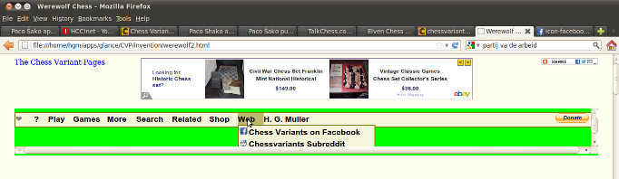
[Edit] Forget it, this idea does not work. I made a 'mockup' of the CVP website by copying the /g/global.css style file and all icons in /index (and /ads/showads.js) to my Linux VM, and put the page source of /invention/werewolf-chess on a file with .html extension. Showing the latter in my browser gives a reasnable reproduction of how the page looks on the site itself. (For reasons I have not identified yet the ebay ad below the menu bar stays blank, although the ebay ad in the banner does appear). This does result in a fully operational menu bar (at least as far as opening menus and sub-menus; when you actually select a menu item, the link is usually broken, as it points to a onsite file/script that I did not copy).
This allowed me to experiment with the menu bar. It was possible to migrate the menu section of the page source together with its styling to an external html file, and include that as an object (although that gave a margin of about 5 pixels around it that I did not managed to suppress yet). Such a wrapped menu bar responds to mouse hover for popping up the menus. But what kills the idea is that the menus that pop up are confined to the size reserved for the <object>:
I added
max-width: 100%;to the CSS for the ARTICLE element, and it seems to have fixed the problem.
Good trick. I will try that in the diagram design wizard too. For some reason long lines in a <pre> element (like what I use to present the generated HTML code in the wizard) now force the element wide enough to completely contain them, rather than wrapping. That didn't use to be a problem in the past. But restricting the width as a percentage of the parent element might combat this problem.
Thanks for looking into this. It saves me the effort. Objects may still be useful for ads. So I'll look into that. PHP looks similar to JavaScript. Both can be mixed with HTML, and both use a C-like syntax. The main differences are that
- JavaScript can access the DOM, and PHP can access the database and environment variables.
- PHP can write files to the server, but JavaScript cannot.
- When you look at the source of a PHP script in your browser, you will just see the generated HTML, not the PHP code actually written in the script.
Here I will be testing out some different text-rendering options. I will repeat the same text with multiple options for the sake of comparison. The first will use optimizeSpeed, the second optimizeLegibility, and the third geometricPrecision. Ligatures should not work, because I already turned them off in the CSS due to unwanted ligatures like an ff ligature that made the two f's look different. (ABCDEFGIJKLMNOPQRSTUVWXYZ) + [abcdefeghijklmnopqrstuvwxyz] 1234567890! Is this a question? The quick brown fox jumps over the lazy dog. Every good boy deserves favor. The rain in Spain falls mainly on the plain. Chess is related to the games Shogi and Xiangqi. What is a jiffy thing to say?
Here I will be testing out some different text-rendering options. I will repeat the same text with multiple options for the sake of comparison. The first will use optimizeSpeed, the second optimizeLegibility, and the third geometricPrecision. Ligatures should not work, because I already turned them off in the CSS due to unwanted ligatures like an ff ligature that made the two f's look different. (ABCDEFGIJKLMNOPQRSTUVWXYZ) + [abcdefeghijklmnopqrstuvwxyz] 1234567890! Is this a question? The quick brown fox jumps over the lazy dog. Every good boy deserves favor. The rain in Spain falls mainly on the plain. Chess is related to the games Shogi and Xiangqi. What is a jiffy thing to say?
Here I will be testing out some different text-rendering options. I will repeat the same text with multiple options for the sake of comparison. The first will use optimizeSpeed, the second optimizeLegibility, and the third geometricPrecision. Ligatures should not work, because I already turned them off in the CSS due to unwanted ligatures like an ff ligature that made the two f's look different. (ABCDEFGIJKLMNOPQRSTUVWXYZ) + [abcdefeghijklmnopqrstuvwxyz] 1234567890! Is this a question? The quick brown fox jumps over the lazy dog. Every good boy deserves favor. The rain in Spain falls mainly on the plain. Chess is related to the games Shogi and Xiangqi. What is a jiffy thing to say?
Greg Strong wrote on Thu, Oct 12, 2017 02:33 AM UTC:If the three paragraphs are supposed to appear different, either they don't or it's too subtle to see.
I'm starting to worry about you, dude. You migth be getting a little OCD with the font stuff :)
It's just a test, Greg. I learned about a new CSS property, and I was testing what effect its different values would have. For the fonts I chose, they appear to have none.
Using the Android Browser on my Toshiba Thrive tablet, I do see a difference. Less text fits on the line with optimizeSpeed than with the other two. For the latter two, the spacing is narrowed between some letters, such as the two l's in will, the two f's in different, the ow in brown, the ov in over, or the whole word jiffy. I have not noticed any difference between the effects of optimizeLegibility and geometricPrecision.
I am seeing the same effect with Boat Browser, which uses Droid Serif instead of the Google fonts. I also noticed that words like main and spain are tighter with oL or gP.
I tested browsers on my two Android phones, but I waited until I turned on my computer to report the results. On my large Android 6 Marshmellow phone, I tested Chrome, Firefox, Boat Browser, and the default Android Browser, and I saw no difference between any of the text samples with any of them. On my small Android 4.1.2. Jelly Bean phone, I tested Chrome, Firefox, Boat Browser, Dolphin, Maxthon, and the default Android Browser. Of these, I saw a difference between the text samples in the Android browser, in Boat Browser, and in Maxthon, but I did not see any difference in Chrome, Firefox, or Dolphin. For reference, my Thrive runs Android 4.0.4. Ice Cream Sandwich.
I just installed Safari for Windows, since at least some of the browsers that I saw a difference in on Android were Safari-based. Although there is no difference in which word each each line ends with, I could detect small differences by taking a screenshot and using a veritical line in a graphics program as a guide. Unfortunately, optimizeLegibility and geometricPrecision are both turning on ligatures in Safari.
I fixed some ad alignment problems with Safari for Windows. One typography problem I noticed with it, which I've been unable to fix, is that when it uses the Volkhov font, all the text is in italics. Does anyone else experience this with Safari?
The text does not appear in all italics on the iPad version of Safari. If it is limited to Safari on Windows, I can live with that, since Safari is probably one of the least popular browsers on Windows. But if this also happens with Safari on the Macintosh, that is more serious, and I will probably have to precede Volkhov with an appropriate Macintosh system font. I can't test this myself, since I don't have a Macintosh. If anyone out there does have a Macintosh, please let me know if all the serif text appears in italics when you narrow the window enough for the sidebar ads to disappear.
Greg Strong wrote on Sun, Oct 15, 2017 10:45 PM UTC:There's an issue with the commenting page (commentonitem.php). When you submit, it takes you to a preview page that says to click the back button if you want to make a change, but when you go back, the text box is blank. I'm not sure why this would be the case. I suspected it had to do with the CKEditor, but that turns out not to be the case. I commented out the script line that replaces the edit box with CKEditor just to text adn the standard text box has this problem too.
I'm not sure how to fix this issue, but as an alternative, I think I can add a Revise button next to the Submit button that calls up the commentonitem.php page again. This might be superior anyway. Going back doesn't require a page load, but I think use of the browser's back button is discouraged in modern web apps.
I have been thinking of doing something along those lines. I have plans to replace the multiple commenting pages with a unified page that responds differently to different form data. This is basically how other scripts I've made work. This will make it easier to include a Revise button alongside a Submit button. As it is now, these two buttons would need completely separate forms, since they would call different scripts. With a unified script, they would both call the same script, and that one script would handle each button differently.
I'm trying to use a different font for italics on wide displays that use Average. Smaller displays using Volkhov will still use Volkhov. Here is Roman type:
ABCDEFGHJKLMNOPQRSTUVWXYZabcdefghijklmnopqrstuvwxyz1234567890?
Here is italics:
ABCDEFGHJKLMNOPQRSTUVWXYZabcdefghijklmnopqrstuvwxyz1234567890?
H. G. Muller wrote on Mon, Oct 16, 2017 07:05 PM UTC:I noticed that you switch to a denser font (almost like boldface) when the viewport width shrinks below a certain value. I can see this is useful, because at low resolution you need a deser font to maintain visibility. But it doesn't seem to happen in a logical way: When I gradually narrow the window, the width of the article part goes through a kind of sawtooth motion, because the ASIDEs are switched off one by one. The switch to the denser font now occurs when the last ASIDE (the narrower "rightcol") closes. But at that point there are some 240 more pixels in the ARTICLE width then there were just before that ASIDE closed. So there isn't really any reason to switch to the denser font yet. I would expect this to occur only after the viewport is narrowed so much that even without ASIDEs the width is forced smaller than it ever was with any ASIDE open.
The original cutoffs were based on how much room was available for the sidebar ads, and when I added Google fonts, I used the same cutoffs. It is hard to pick where the cutoff should be. On the one hand, I want it to use Volkhov on phones, and the greatest width I have found listed for a phone is 1920, which is actually wider than my own desktop monitor, which is only 1680. Lower phone widths I've found include 1334, 1136, and 960. 960 is about where the change feels comfortable on my desktop, and that is where I have now set it, but a larger value might be more suitable on phones with high resolution displays. I could try testing width in units of inches or centimeters, but I would still be working in the dark concerning how the display would look on phones I don't own.
I have learned from Responsive Font Size with CSS that
most computer screens have similar pixel densities and modern mobile devices adjust by reporting viewports smaller than their real resolution to make up for their high pixel densities. For example, some 1920x1080px phones have a viewport size of just 640x360. What this means is that 16px text takes much more than 16 real pixels, 48px in fact (16*1920/640).
What this means for me is that phones with high resolutions should still display Volkov at appropriate sizes, and I may as well keep the cutoff at 960. On my 10.1 inch tablet, I should still expect to see Average in landscape and Volkhov in portrait.
For the sake of consistency, I'm looking into using a Google web font for the menu instead of fonts on computers. I previously had it set up so that on my desktop, it would use Segoe UI, which comes with Windows. I checked out some Google web fonts today, and I narrowed the choice down to Noto Sans, Open Sans, Roboto, Signika, Source Sans Pro, and Tauri. Here is a graphic image showing all of these plus Segoe UI being used for the menu for the homepage. I wrote the name of each in Segoe UI with the graphics program.

I'm trying out Noto Sans and Noto Serif as the two main fonts used by the site. They look fine on my desktop, but when I have tried my Kindle Fire and my iPad, I have been unable to reload the CSS to see what these look like on these devices. While my desktop browers make this easy, the same browsers on mobile are less functional. Maybe I'll try downloading a new brower I haven't used before.
I installed Opera to my Kindle Fire, but it didn't help. It is still showing Average, Kurale, Volkhov, and Catamaran instead of the Noto fonts. I may be dealing with caching at the DNS level. I could try creating some test files that don't use the cached files.
I created a test file and previewed the Noto fonts in action. They look fine on mobile, which is not too surprising, since they are based on the Droid fonts, which were designed for mobile devices. On the desktop, Noto Sans looks fine, but Noto Serif looks a little too large. As I was looking over the sans-serif fonts, I settled on Noto Sans, because it put bars on the capital I and generally looked good. It is also part of the Noto series, which has been designed to support more languages than any other font. I thought it would be nice to use matching serif and sans-serif fonts, and Noto Serif is a good font in many respects. It also includes a real italic. The Average font came with only one style, and I was using the Kurale font to handle its italics, since it's a more italic looking font that otherwise resembles Average. When it comes to Chinese characters, Noto Serif looks better than Average, though I still like how Average+Kurale looks on the desktop, and I still like how Volkhov looks on mobile. I'll go with Noto Serif for now and continue looking at other fonts.
On my phone, Noto Serif is looking better than Volkhov.
For now, I have gone back to using Average, Kurale, and Volkhov for the body text. I'm looking for a single serif font with its own italic style that I could use for the body text on both desktop and mobile. When I have the time, I'll try out Lora, which is by the same designer as Volkhov.
This site now uses Lora for body text and Noto Sans for header and menu text. These are both free web fonts available through Google fonts. I purged the global CSS files from the cache, which allowed me to see changes to them on mobile devices. I increased the font size on mobile devices to 18px, matching what it is on desktops, and I set the size of blockquote text to 16px, which seems a bit more legible than using smaller.
I learned last night about a new type of font file called a Variable font. This includes all the styles for a typeface within a single file. Previously, each style of a typeface would get its own font file. Since the typeface used for the main body of this site was now available as a Variable font, I updated it. But while I was at Google Fonts today, I decided to check out other fonts.
I ended up replacing Lora with Literata. This typeface was designed for use with Google Play Books, and its basically the Google counterpart to Amazon's Bookerly. I liked it better than Lora for a few reasons.
- It looks cleaner at small sizes. At the size of text used on the website, some characters in Lora have a bit of a blur to them, because they are being anti-aliased to look good at a smaller size than they were actually designed for. At the same size, characters in Literata lack this blur.
- Its lowercase letters have a lower X-height, which creates more contrast between upper and lowercase letters.
- Although its Q does reach underneath the next letter, it's only by a little bit, and I otherwise prefer the look of its Q, whose curved tail is similar to the one used in Century Schoolbook.
I also replaced FreeMono with Courier Prime, because with Game Courier on the site, I wanted a Courier monospace font. I have begun using it instead of the sans serif font for headings.
While I did try some other sans serif fonts, I stuck with Noto Sans. Presently, Literata is the only Variable font on the site. The others use individual font files for each style.
I've been working on redesigning the headings so that one can intuitively tell one level from another. Besides decreasing in size, they also differ in style.
Heading One: Centered
Heading Two: Double Underlined
I had originally just used underlining, but I changed it to double underlining to avoid confusion with links, which are normally underlined with a single line.
Heading Three: Normal
Heading Four: Italics
Heading Five: Small-Caps with Overline and Underline
Because small-caps are more compact, they are used for lower headings rather than for higher ones. The use of lines parallels the use of lines in the second heading. Because small-caps all have the same height, words have a more straight appearance, which works better with the overline.
Heading Six: Small-Caps
Like the change from heading two to heading three, heading six omits the lines used in the heading just above it.
Here is why I am using small-caps for headings five and six instead of for heading two, as I used to do in Game Courier:
Using small-caps reduces the width of the line in Courier Prime even though it is not proportional.
Using small-caps reduces the width of the line in Courier Prime even though it is not proportional.
68 comments displayed
Permalink to the exact comments currently displayed.
If the server ran out of bandwidth, you wouldn't be getting any message from the server, and pages wouldn't load at all. Also, multiple servers just call themselves the server. There is also the MYSQL server, the Apache web server, and the PHP server. I'm not sure which one is giving this message, but I have since optimized a lot of PHP code and MYSQL queries.
Between using WIFI and being on the other side of the Atlantic, there might be a slowdown for you. I often find that WIFI is slower than a direct ethernet connection to the router.
I have no idea what improper design you have in mind. The code you mentioned serves a purpose, and getting rid of it would be gutting functionality.
The banner is centered on the screen, and as soon as there isn't room for it to remain centered on the screen between the logo and the share widget, it drops down lower.