Comments/Ratings for a Single Item
 H. G. Muller wrote on Tue, Mar 19 05:46 AM EDT in reply to François Houdebert from Mon Mar 18 12:38 PM:
The rightmost board-painter image looks like it would fit well within the set. But are we allowed to use it?
I will redraw the Cobra more like the opper part of the rightmost image.
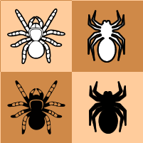
I have already tweeked the 3d Spider enough to make it acceptable.
Here are some cobra tests:
- the same without the tongue
- another in profile
- the last one less round, I'd thicken the lines if it's worthwhile
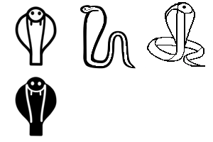
Well, I think the existing cobra is okay. I don't know whether to look for a better one or make slight improvements to the existing one.
I'm going to try it out.
Would the existing spiders in the musketeer editor be suitable?
H. G. Muller wrote on Mon, Mar 18 11:10 AM EDT in reply to François Houdebert from 03:25 AM:I was wondering if we could finalize the 2d and 3d visuals for team mate.
The following things would have to be done there:
- The 2d Cobra image would have to be improved. (There were complaints it looked too much like a tennis racket.)
- The Spider must be added to the fairy piece set. This requires:
- Creation of a 2d Spider icon for in res/fairy/icons.
- Adding that to the wikipedia-fairy-sprites.
- Some hand-editing of the 3d mesh file, for shaping up the inner legs.
- Making a visual of the 2d+3d representation for in res/rules/fairy.
- Making the team-mate view use those.
- Make 2d and 3d visuals of the team-mate setup.
- Making a new thumbnail.
I think I will start with the mesh editing.
I was wondering if we could finalize the 2d and 3d visuals for team mate.
I have a feeling it's the last remaining important task for the pull request. It might be an opportunity to reconsider the choice of sprites for phoenix, cobra and acromentula, which might have also an impact on the rules as well. I can help if needed.
I like it this way. It will make the game much more accessible. I've also added a draft file of rules that you should feel free to revise.
There are still some 'quick wins' for jocly, I'm thinking in particular of Team-Mate Chess. If you use phoenix, cobra and may be mortar sprites. It would be easier to start with.
After I know that you might use a spider for the acromentula, but if you don’t, a rhino would be easier than the eagle.
Good idea. Note That I have amended the rules of shogis included chu shogi.
H. G. Muller wrote on Wed, Mar 6 04:21 PM EST in reply to H. G. Muller from 02:18 PM:I made the Tori sprites, and pushed those to pullreq. I did demagnify the Goose somewhat, as it seemed unreasonably large for such a weak piece.
To have the white Quails look towards the center, the Right Quail had to look to the left. I don't know if that should be considered confusing.
H. G. Muller wrote on Wed, Mar 6 02:18 PM EST in reply to François Houdebert from 02:16 PM:I think so. The Stork, Elephant, Leopard and King are all in the fairy-sprites.
There only is the matter of diversifying the Quail. It is probably best to have the Left Quail look left for both colors. Then the pieces are flip-invariant. I does mean that in player A view the white Quails look inward, the black Quails outward.
Looks good to me. Do you have all the sprites for a set?
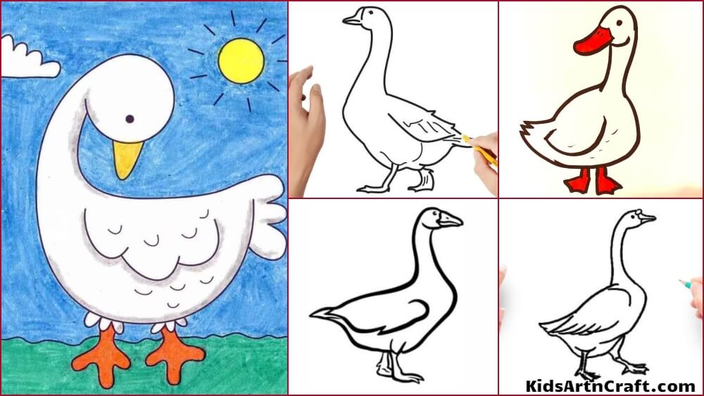
H. G. Muller wrote on Wed, Mar 6 02:09 PM EST in reply to François Houdebert from 11:43 AM:The Goose is excellent. For the Pheasant and Quail, I made these:


for my part I prefer representations based on the move.
I made a second try. What should be kept / improved / abandonned ?
For the quail, I was not inspired, I tried a quail chick (hieroglyph) or origami (japanese theme). But I can try more.
For the pheasant : 4 candidates ...
H. G. Muller wrote on Wed, Mar 6 09:56 AM EST in reply to François Houdebert from 09:11 AM:It is always a dilemma whether one should pick the representation based on the move or on the name. I tend to go for the move; names you can in principle do without. E.g. in Elven Chess the Warlock is represented by a Lion, not by a Wizard symbol.
A move-inspired pictogram representation for Tori Shogi would use the King for Phoenix, Leopard for Crane and Elephant for Falcon. The Goose, Pheasants, Eagle and Quails are unique to Tori Shogi. We happen to have a good Eagle pictogram, but for the others 'anything flies'.
Name-based pictograms offer the challenge to make many different distinguishable and recognizable birds. That is hard, as some of the birds would look very similar. The sprites you used are all very much out of style with the Eagle. We do have a Phoenix and a Falcon in the fairy-sprites, and as far as I am concerned the Stork we have there is indistinguishable from a Crane (other than by coloring, which the pictogram does not show). That also leaves Goose, Pheasant and Quails. For the Quails this one would be in style. (But is seems to be copyrighted...) For a Pheasant this one is the closest I could find. (But it is too wide; to match it in scale we would have to cut off the tail feathers. But a long tail is the main charcteristic for a pheasant; otherwise it looks like an ordinary cock. This one has the right style, but I don't recognize it as a pheasant.) This seems a good Goose. (But again a copyright issue.) Perhaps something based on the top-right drawing here (omitting the colors).
[Edit] This could also make a good Quail.
And the head of this one could be a good basis. I recognize it as a pheasant even without the tail.
Thanks.
I've added the skin that uses these sprites as well as the rule files I had already created.
Feel free to rework them as you want, I just wanted to have a minimum doc by default.
Would you be inspired to do the same for shogi tori?
I tried it out but it wasn't very accomplished, but perhaps you have some pictograms that might be suitable ...
Maybe there'll be some artists on the cvp site who'll be inspired...
We can also rework the sprites to be finalized if we agree on a first draft
H. G. Muller wrote on Tue, Mar 5 04:55 PM EST in reply to François Houdebert from 03:25 AM:OK, I pushed the reworked sprites to pullreq, under the name shogi-picto-sprites.png.
no problem, Jocly can wait, we'll talk when you're free.
H. G. Muller wrote on Tue, Mar 5 07:35 AM EST in reply to François Houdebert from 03:25 AM:How about using the Prince fairy sprite for the Jeweled General?
Sorry I had so little time to spend on Jocly; there was an emergency at the talkchess.com forum, for which the hosting was terminated per March 1, and for which we had to set up a new server. We managed to do that in time, but there still are some imperfections that have to be ironed out. But I will try to update the shogi picto sprites.
I'm back on the subject of adding a skin with black and white pictograms in jocly for the shogi in addition to the kanjis, at least on the current pull request. For the moment, the candidate skin can be seen on this link.
I remembered that having a tokin appear in this form was not consensual, it could be replaced by a gold general or the icon could be different...
Tell me if it's acceptable as it is, if we should wait for another one or leave it as it is.
For CVP we could add even more skins but I think we need at least one alternative skin for the basic jocly.
For the pullrequest in progress, I'd be interested in a skin that suits you for the shogi, with pictograms and colors.
I don't know if you have the time to come up with one right now, but it would be an important step in finalizing the work in progress.
A distinct file would have the advantage of being easy to customize.
H. G. Muller wrote on Wed, Feb 28 01:37 PM EST in reply to Fergus Duniho from 12:49 PM:Coloring the pieces of each side differently can limit the use of color in distinguishing between types of pieces.
Not really, because there are more than two colors. It is very possible to pick two different dark colors (black and blue), and two different light colors (white and yellow) where for each pair the "Spot the Intruder" game is just as easy, and then use blue and yellow for promoted pieces.
Most Shogi sets I have seen do not have red kanji for the promoted pieces, btw. They just write different kanji on them. (Well, people tell me they are really the same kanji, but in different fonts. But they look different enough.)
It's not for you to say what Japanese people would think, and it is not for Japanese people to judge whether one of my experiences feels more authentic than the other.
I am just relaying what Japanes people said, on the Shogi forums I visited, and at the OTB Shogi tournament in Kanazawa and Yokomama that my Shogi engine participated in. And you surely give a whole new twist to the concept 'authentic'.
I have not had any communication with them on this, but it would be as objectively false as saying that you are not playing Chess if you don't use Staunton pieces.
This has puzzled me too. We have no trouble recognizing a game with, say, Star Wars puppets as Chess. For Shogi that would be unthinkable. The Japanese seem to consider the physical representation just as much part of the game as the rules for how to move the pieces. That explains why the Japanese Shogi Association is so conservative in endorsing any kind of on-line play. They insist that the experience behind the computer screen must be as identical as can be technically expected to playing over the board with the prescribed equipment. Including the possibility to play illegal moves.
I suppose it must be that way, because the over-the-board equipment, being subject to physical limitations, is inferior to what you could do on a computer screen. (Funny story: when I was playing in Kanazawa, my program was of course showing the position as pictograms, even though the official board on which I had to perform the move used of course kanji tiles. And it puzzled many people, both opponents and audience, that I used different color pictograms for both sides. The said ro me: "How can this work? When you capture a piece, it has the wrong color." It did not occur to them that a computer can change colors at will.) So if they would allow people to use arbitrary representations, these would quickly move away from the traditional representation, and use one that doesn't hurt their rating so much. If they would have been confident that kanji tiles were the superior representation, they would not have little reason to forbid anything else. But as it is, they consider it cheating.
This is one of the most important reasons that a good game like Shogi has failed to conquer the world: people that try to popularize it usually have as their main agenda to spread Japanese culture. No to spread a good game.
I added the two skins on the same link
Yeah, sure. Who needs the reminder of pieces? You might as well play blindfold...
That's just a false equivalency, as I was saying nothing of the sort.
Recognizing the piece type is of course at least as important as recognizing the color.
I agree that recognizing piece type is at least as important as recognizing sides. But I want to emphasize here that it recognizing sides that is important, and recognizing sides by color is just one way it can be done. In a regular Shogi game, recognizing sides by orientation is not difficult for me.
Coloring the pieces does not have any effect on the ability to recognize the type symbol, though.
Coloring the pieces of each side differently can limit the use of color in distinguishing between types of pieces. The Alfaerie set, for example, does not use color at all in distinguishing between promoted and unpromoted pieces, whereas the Motif set does. The western set for Jocly makes some use of color in distinguishing promoted from unpromoted pieces, but it doesn't make promoted pieces stand out as much as the Motif set does.
So it isn't really relevant that you also have to recognize the type; there is no need to degrade the side recognition for improving the type recognition.
My point is that multiple factors go into the suitability of one set over another, and it would be wrong to say that one set is unequivocally superior on the basis of one metric.
And it will probably also not be contested by anyone here that for westerners kanji are doing a poorer job at that than pictograms, as far as type recognitiion is concerned.
I believe there are westerners who claim to have no problem with Kanji, but you and I are agreed on preferring pictographic pieces.
From whatching Chu-Shogi games by experience Chu-Shogi players, I noticed that these frequently blunder in an elementary way (such as overlooking a discovered attack on a high-value piece), and that I, as a non-player, could almost always predict when they were going to blunder.
I don't play Chu Shogi at all, but this is the kind of error I'm more prone to when playing Shogi with Kanji pieces.
As to the auhenticity... Seems to me you pretty much threw that out of the window when you abandoned the kanji. No Japanese would ever agree that there is any authenticity in these pieces.
It's not for you to say what Japanese people would think, and it is not for Japanese people to judge whether one of my experiences feels more authentic than the other.
In fact I noticed they tend to even deny that you are playing Shogi, when you use non-kanji pieces.
I have not had any communication with them on this, but it would be as objectively false as saying that you are not playing Chess if you don't use Staunton pieces.
H. G. Muller wrote on Wed, Feb 28 10:41 AM EST in reply to Fergus Duniho from 09:57 AM:It went more quickly with Alfaerie, because it's easier to spot differences in color than differences in orientation. However, while doing it with Alfaerie, I was not taking any time to get any sense of the position, yet I would certainly have to do that if I were playing Shogi. Also, Shogi does not progress from one random position to another. The position changes incrementally, starting from a position where I already know where everything is without even looking at it. So, I would be able to use my knowledge of previous positions to understand what the slightly new position is.
Yeah, sure. Who needs the reminder of pieces? You might as well play blindfold... Well, for GM players that is actually true. When they think far ahead they intentionally don't look at the board, because it just distracts them with the current position. But for mortals like us playing blindfold is a huge handicap. The sole purpose of having a board and pieces is to constantly remind us of what stands where. And the test shows that Alfaerie des a better job at that.
Recognizing the piece type is of course at least as important as recognizing the color. (Some servers offer an interesting 'semi-blindfold' mode, where you can see the side pieces are on, but not their type, like playing with blank tiles or checkers.) This was never contested. Coloring the pieces does not have any effect on the ability to recognize the type symbol, though. (I hope we agree on that, rather than having to prove it with a 'Spot the Queen' applet...) So it isn't really relevant that you also have to recognize the type; there is no need to degrade the side recognition for improving the type recognition. (And it will probably also not be contested by anyone here that for westerners kanji are doing a poorer job at that than pictograms, as far as type recognitiion is concerned.)
From whatching Chu-Shogi games by experience Chu-Shogi players, I noticed that these frequently blunder in an elementary way (such as overlooking a discovered attack on a high-value piece), and that I, as a non-player, could almost always predict when they were going to blunder. Because I was viewing the game with mnemonic pieces on my bot, while they were using the standard kanji pieces of the client. So it was obvious to me they suffered a iszable handicap by not seeing the board and pieces as I did it. It will of course make a great deal of difference how much time you have available. In correspondence play, where you think perhaps an hour per move, chances are good that after some time it will start to dawn on you that you misidentified a particular piece, and when you do you have every opportunity to think again. In real-time games you often will move before realizing your mistake.
As to the auhenticity... Seems to me you pretty much threw that out of the window when you abandoned the kanji. No Japanese would ever agree that there is any authenticity in these pieces. In fact I noticed they tend to even deny that you are playing Shogi, when you use non-kanji pieces.
It went more quickly with Alfaerie, because it's easier to spot differences in color than differences in orientation. However, while doing it with Alfaerie, I was not taking any time to get any sense of the position, yet I would certainly have to do that if I were playing Shogi. Also, Shogi does not progress from one random position to another. The position changes incrementally, starting from a position where I already know where everything is without even looking at it. So, I would be able to use my knowledge of previous positions to understand what the slightly new position is.
There are only two cases where I might need more time to figure out what the position is. One is when I am doing problems instead of playing a game, and the other is when an opponent has taken a long time to move in a correspondence game, and the position is no longer fresh in my mind. In each of these two cases, though, I would have time to examine the position.
Using Kanji pieces, I can sometimes not be aware of what every piece is, but I am aware of what each piece is with the Motif pieces, and in actual play, I have not had any problem telling my pieces from my opponent's.
So I do not expect that using differently colored pieces instead of differently oriented pieces would seriously improve my ability to understand positions while actually playing Shogi. And if there is any performance improvement to be gained, it remains less than the performance improvement gained from using pieces I can easily recognize.
Additionally, using wedge-shaped pieces adds some authenticity to the experience of playing Shogi, sort of like watching anime with subtitles over the original audio instead of dubs in my own language, and it allows the use of color for distinguishing between promoted and unpromoted pieces. By not using color to distinguish them, the Alfaerie set makes it harder to spot promoted pieces. So, if you made a similar test for spotting promoted pieces, Motif would do much better than Alfaerie.
25 comments displayed
Permalink to the exact comments currently displayed.
The inspiration comes from here. Same kind of drawing tutorial here.
I'd say you can take inspiration from a drawing tutorial to make your own drawings, as long as you customize them enough.