Comments/Ratings for a Single Item
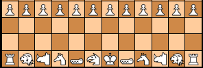
I'd dump Falcon and use two Manticores to best fit name :)
I removed your outer div, which had an unnecessary margin, and I removed the rimColor assignment to stop it from making the board larger by adding a border around it. It now shows up in two columns in landscape on my iPad.
This game's interactive diagram still puts the panel bellow the board. I don't know why. It works well for the other 5 games!
I have edited the text of this page and published it.
For the task of displaying a variable number of columns depending upon the screen width, flex is the natural tool to use. However, this requires some structuring of the HTML to work properly. Where that structure was absent, grid code in a container query provided an alternate solution. At a certain breakpoint, the grid code would display things in two columns, and below the breakpoint, it would not go into effect. The flex solution does not require a container query, as it naturally adjusts its display to the available space. While there is a grid solution that can work without a query, it takes some trickery and does not work as well. Since the flex solution does require some extra HTML, I have put it all together in a fork of betzaNew.js called /fergus/betzaFlex.js. This page is using that fork without any additional CSS added to the page.
I had forgotten the wrapper div, which was required for my container query to work. I added that in, but it is still not displaying in two columns. But I will stop working on it tonight and continue tomorrow.
For this one, I copied over my grid CSS and changed the script to my /fergus/betzaNew.js fork to see what would happen. It displays in only one column. So, I'll rewrite the grid CSS to work with the new DIVs this fork adds to the HTML.
9 comments displayed
Permalink to the exact comments currently displayed.
Why is that? The falcon is a rook strength piece. With two Manticores there would be three strong pieces and two medium strength pieces! To me having three medium pieces and two strong ones seems a better distribution of strength.